Shared posts

25 Jul 22:02

Reader Space: A Happy Home Office

by iheartorganizing
I go through all sorts of organizing phases.  I think it keeps things interesting.  Last week I was focused on the outdoors, this week I am obsessed with home offices.  And I have a home office to share with you today, which might be the reason behind this week's obsession.


Gaby is a sweet as pie blogger who lives in Scotland and shares her beautiful home and organizing projects on her blog Life in Eight.  She recently decided that she was going to take back her home office, as it was shining as bright as she knew it could.  Here is a quick glance at what Gaby was working with.


This girl is getting long distance high fives from me right away.  She started this project right.  She emptied the space completely to give herself a fresh perspective.


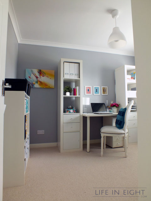
And it worked!  Here she is now to share the results of her home office organization and some tips as well!


What is the main function of the space?

"This is the smallest room in our house but the one that we expect the most from in functionality terms!  It is mainly an office but it is also a craft room, reading nook, chill-out room.  It can also serve as a guest room during those festive periods when all the family is around.  Children love to stay there with their ready-made beds!"


Any superstar tips for keeping it organized?

"Labeled containers, folders and boxes for everything!  In our home, clutter usually occurs when things don't have a designated place to live.  Things get placed "temporarily" {for that, read for months on end!} in the room where they should go.  The solution?  Labeled folders and boxes!  We have added some filing trays that have worked well as a tidy holding area for paperwork.  Before the makeover, this type of correspondence would just pile up on top of the desk.  Nowadays the pile of paperwork doesn't get the chance to grow so big.  It's really helped us to keep on top of it."


What items did you find were essential when organizing this space, and why?

"Boxes, boxes and more boxes.  Hubby has a big collection of CD's and DVD's that used to live in four IKEA Benno towers that took up a lot of wall space and created a lot of visual clutter.  As I've not persuaded him to go digital {yet}, I decided to use boxes to organise them.  As I went for the cheap option without book plates, I designed my own labels.  If you like them as much as I do, you can download them here.  I use these labels to keep the CD's in alphabetical order and the DVD's by genre.  It's been working great!  I love seeing hubby going to the boxes and getting his CD of choice.


In addition to the boxes, I just love, love, love the Expedit attachments with the little doors from IKEA.  They gave us the possibility to hide some bigger items that wouldn't fit in any of our drawers or boxes, like the laminator and paper shredder.  These kinds of things are not decorative or pretty so it is good to have a place to disguise them!"


What did you do to go the extra mile and "Make it Pretty"?

"I hung colour coordinated prints and a canvas.  I also used pretty wallpapers to up-cycle boring old boxes and folders and give them new life.  I think they look pretty smart."


How has this space impacted your life for the better?

"This has now become one of our favourite rooms in the house.  It is our happy place where we come just to enjoy some reading, blogging or just good old fashioned chilling out.  Before that, the room was a mess.  In fact it was an upsetting mess {which was even worse!} that we conquered.

Gaby 1 Clutter 0."


Let's take a minute to chat about why I am so head over heals for this happy home office:

  • I love that Gaby painted the walls a fresh color.  That is always a great way to find new inspiration for a room update.  It instantly gives the room a facelift with a very small investment.
  • Gaby used a lot of what she already owned, by removing all of the items, it gave her the opportunity to place them back where they made more sense.  I love that you now see her pretty workstation when you peek in from the hallway.
  • The updated light fixture is simple yet dramatic.
  • She has a great combination of open and concealed storage.  She disguised the less sightly necessities behind doors.
  • Those DVD and CD boxes are so gorgeous with her DIY labels, and I love that she was able to find a compromise with her hubby.  
  • All of the white really makes the room feel fresh and grand, even if it is a smaller room in their home.
  • She brought in her own personality and some pretty color through art.
  • She added a lamp to her desk, which is often times forgotten but really great for late night blogging or bill writing.
  • And last but not least, the room makes her happy.  Isn't that what it is all about.  Giving you those sweet tingles when you walk in each time?  Love.

Congrats to Gaby for taking back her home office and making it such a lovely place to work.  You can snag all of the details over on Gaby's blog here.

 
ATTENTION!!  Want to be featured in a Reader Space edition?  Have an awesome organizing story to share?  I am looking for projects that have made a positive impact to your life.  Please submit your story and photos here and I would heart to feature them right here, on the blog!!  Photos should be high resolution and unedited.  Please include a description of the project, including any costs, inspiration, and how it has changed your life and routine for the better!  Oh, and no worries my friends, we will NEVER judge "before" pictures because that just wouldn't be nice!  Only love goes on at this blog!


25 Jul 21:50

De Lego Para o Futuro

by noreply@blogger.com (ANDRÉ Montejorge)
Não disse que Lego tá sempre aqui?! Mal fiz um post e já tem Lego outra vez! Mas é por uma boa causa! Afinal, eu precisava compartilhar que em 1º de agosto chega ao site da marca o kit The DeLorean time machine! Na caixinha vem, além do carro, lógico, dois mini-bonecos - Marty McFly e Doc Brown -, jogo extra de rodas e motor e ainda o famoso skate! Agora o mais legal é que ele foi escolhido através do Lego Cuusoo, que faz a votação e seleção de projetos enviados por pessoas comuns, o que inclui qualquer um de nós! Bom, o pequeno DeLorean (tem apenas 15 cm de comprimento) custará U$ 34,99, como eu disse, a partir do próximo dia 1º. "Futuramente legaus"!
25 Jul 21:50

Concreto listrado

by noreply@blogger.com (ANDRÉ Montejorge)
O projeto já tem dois anos, mas eu não conhecia. Trata-se de Revolver, o inusitado trabalho do italiano Rub Kandy que simplesmente transformou um caminhão-betoneira. Com váááárias latas de tinta spray, fita crepe e muita paciência ele deixou o balão, aquele compartimento onde é feita a mistura do concreto, totalmente listrado e com um visual único. Um jeito divertido e colorido para encarar o cinza do concreto e a sujeira de uma obra. "Listradamente legaus"!
Link para a fonte
28 Jun 15:37

Mochila de baguete

by noreply@blogger.com (ANDRÉ Montejorge)
Bisnaga, baguete, pão comprido, seja lá o nome que usam na região que você mora, é para ele que foi criada a Baguette Bag! Acredite ou não, ela existe e é criação da turma de um estúdio ucraniano chamado CYAN. A ideia, já que na Europa as pessoas têm o costume de sair da padaria com o pão embaixo do braço, é manter o baguete crocante, inteiro e quentinho, já que o interior da bolsa é térmico. Basta colocar o pão ali dentro, colocar a alça no ombro e levar pra casa o personagem principal do café ou lanche. A Baguette Bag é feita em 4 opções de cores - amarelo, marrom, verde e cinza. - e custa 45 euros. "Enfarinhadamente legaus"!

27 Jun 15:44

Most Useful Color Tips and Tools for Web Developers

by Dibakar Jana

Color is an often-overlooked factor in the design process, pushed aside in favor of typography, layout and imagery. But the truth is that color has a powerful psychological effect, which influences how they choose to buy something, whether they continue browsing your site, and how they respond to your brand. But it can also be one of the most difficult elements to get right. Fortunately, there are many helpful tools to get the creative juices flowing and finding the perfect color scheme for your site.

Color theory helps create an easy way to understand how colors work together, or not. The color wheel, based on the three primary colors red, yellow and blue, was created to show how colors relate to one another. Based on a twelve-part color wheel including all the hues, a designer can start to create the perfect palette.

Analogous colors are any three colors side by side on the color wheel, such as green, blue-green and blue. This type of palette is the easiest to use because you can manipulate the tone, shade and tint to get just the right feel. Usually, one of the three colors will predominate.
Toriseye is a great example of analogous colors in a monochromatic color scheme.

Complementary colors are directly opposite each other on the wheel, for example, orange and blue and yellow and violet. They complement each other and provide striking contrast.
The softer hues of blue and orange on Event Finds, and event planning company, have a calming effect that provides trust in the product. The complementary orange against blue helps the call to action to stand out easily.

Color Context: It’s important to understand how color behaves when paired with other colors and shapes. Against the red background, the gray square appears sharper and larger than against the other colors. The bright yellowbackground washes out the gray and make the square difficult to look at, while the gray appears brilliant against the blue.

However, as you can see in the digital security guide below, a darker shade of gray and a more muted yellow makes the gray-on-yellow scheme not only easier look at, but pleasing to the eye. This example goes to show how important color context is, including brightness and contrast.

There are many tools to help you get started on your search for the perfect color scheme to represent your brand.

1. Shutterstock Color Spectrum:
Shutterstock Color Spectrum provides all the same image searching capabilities of Shutterstock with an added benefit of being able to change the colors and hues of those images. Without it, perhaps you would never realize that, for example, an image of a purple forest is exactly what is needed for your site!

2. Adobe Kuler:
Kuler is a web-hosted application that allows designers to quickly browse through various color schemes, create your own, and look at those created by others in the Kuler community.

3. ColorExplorer:
ColorExplorer is a site that allows you to experiment with innumerable color palettes where you can quickly and easily explore, create, and save color schemes. The toolbox allows users to browse colors based on your own images or graphics, color match, and there’s even a color library to search through.

4. Pictaculous:
With Pictaculous you only need upload a photo and you’ll get an instant color palette based on the image. You can even use your smartphone to upload pictures.

5. ColorBlender:
For help finding the right blend of colors, ColorBlender is the right tool. Simply choose your preferred starting color and ColorBlender will produce a six-color palette, or blend, which you can then tweak to ensure that it meets your requirements.

With all of these tools to help guide you in the color selecting process, there’s no reason not to make color as important as other elements when developing your website. Understanding the effect color has on the way people act and treat your brand shines an intriguing light on the way color can be used to persuade viewers toward a desired outcome.

Related Posts:

27 Jun 15:28

Famous quotes as posters

by Mirko

Minimalist_Quotation_Print_Samuel-Johnson

Ryan McArthur has been creating some beautiful posters based on famous quotes. You can check out more on his Etsy shop.

Minimalist_Quotation_Print_Samuel-Johnson_04

Minimalist_Quotation_Print_Samuel-Johnson_10

Minimalist_Quotation_Print_Samuel-Johnson_06

Minimalist_Quotation_Print_Samuel-Johnson_000

Minimalist_Quotation_Print_Samuel-Johnson_00

27 Jun 15:24

Become Someone Else campaign

by Mirko

195d-someoneelse

An excellent campaign for Mint Vinetu Bookstore created by Love Agency. A perfect illustration of what happens when you are deep into a book.

195c-someoneelse

195b-someoneelse

195a-someoneelse

27 Jun 15:06

Roda de Gin

by noreply@blogger.com (ANDRÉ Montejorge)
Eu não sou muito de drinks e coquetéis, nem curto beber gin, mas adoraria uma Gin Wheel! A sensacional peça é uma edição limitada da Bombay Sapphire East Gin criada em parceria com famoso estúdio de design AvroKO e é para deixar babando qualquer bartender. A Gin Wheel tem tudo o que se precisa para criar bebidas exclusivas. A roda de madeira é feita à mão em um exótico tipo de nogueira escura. No centro fica um compartimento para gelo que pode ser acessado através de duas portinhas, deixando é claro, a garrafa de Bombay Saphire sempre à mostra. No topo uma parte destacável que serve de tampa para mais dois nichos onde podem ser guardados ingredientes para coquetéis, vira tábua de corte quando retirada. Uma pinça fica dependurada na estrutura e a porta de correr abre espaço para o interior da roda e local para acessórios. A Gin Wheel vem com 4 copos especiais para gin tônica, 4 bolachas de madeira, faca, colher, pegador (pinça) e dosador. Custa U$ 500,00. "Rotatoriamente legaus"!
24 Jun 22:02

...

by Jen
24 Jun 22:01

Café com foto

by noreply@blogger.com (ANDRÉ Montejorge)
Semanas atrás eu postei a incrível arte de criar verdadeiras esculturas na espuma de cafés e agora surge mais uma novidade na área. O Let's Caffe de Taiwan oferece aos seus clientes uma opção de imprimir fotos no café. Basta tirar uma fotografia com o próprio celular, enviar para a impressora especial e ela faz o resto. Os "cartuchos de tinta" usam pó de cacau ou café e reproduzem fielmente a imagem, com direito a nome escrito e tudo. Aí você olha, acha legal e bebe, acabando com a brincadeira rapidinho. Mas por alguns segundos é bem legal, né?! "Fotograficamente legaus"!
12 Jun 17:04

Alphabet animals . K is for Koala

by Afsaneh Tajvidi
Koala watercolor painting

K is for Koala
Thank you for your comments about animal starting with K.
 Hope you like the Koala and her baby!

Watercolor on paper
K is for Koala
12 Jun 17:00

Cinema na banheira

by noreply@blogger.com (ANDRÉ Montejorge)
Luciana Pimentel

Uba UBA ÊEEE

As pessoas estão de bermuda, sunga, maiô, biquini, etc, bebericam cerveja gelada, champanhe e coquetéis e beliscam aperitivos e as mais variadas comidinhas. Parece que estou falando de um dia de praia, certo?! Mas trata-se de uma sessão num programão, literalmente para inglês ver e curtir: o Hot Tub Cinema! É isto mesmo que você tá pensando! Sessões de cinema onde os frequentadores não ficam em poltronas, mas sim em quentinhas, massageantes e confortáveis banheiras de hidromassagem! Antes de ficar com nojinho e achar estranho, já aviso que todas elas têm a água trocada e são higienizadas antes de cada filme. Você escolhe: ingresso tipo "camarote", para assistir numa banheira com a sua turma, ou individual, para quem está a fim de conhecer outros cine-banhistas.
Deste mês de junho até setembro o Hot Tub Cinema fica no telhado da Rockwell Shoreditch House, no centrão de Londres e com belas vistas panorâmicas da cidade. Tem opção de comer até um churrasquinho durante o filme. No outono/inverno, quando o clima frio apertar, as banheiras vão para um lugar fechado e mais protegido. Curtiu a ideia de pegar um cineminha assim?! Os ingressos saem 30 libras para os que não ligam em dividir a "bacia" com desconhecidos, 180 libras para a Private Hot Tub, até 6 pessoas, e 240 libras para a Deluxe Private Hot Tub, a maior e mais confortável banheirona, com capacidade para até 8 pessoas. Veja mais clicando no link após o vídeo. "Banhadamente legaus"!
12 Jun 16:52

Impressão Fine Art – Parte 3

by Carlos Alexandre Pereira

Nas partes 1 e 2 deste artigo sobre Impressão Fine Art falei sobre as novas tecnologias de impressão jato de tinta, os papéis utilizados nesse tipo de impressão e, os cuidados que os fotógrafos precisam ter no momento da captura e depois no tratamento das imagens.  Agora, finalmente vou falar sobre o processo de impressão em si. Como escolher os papéis mais adequados para cada tipo de impressão e como os profissionais de impressão podem auxiliar os fotógrafos nesta fase.

Imagem tratada, arquivo finalizado, pronto para impressão. Qual tipo de papel usar? São vários os tipos de papéis a disposição hoje em dia, escolher o papel adequado para cada imagem não é tarefa fácil e o melhor é pedir ajuda aos especialistas, os impressores.

Tuca Vieira Copan Impressão Fine Art – Parte 3

Copan  – Tuca Vieira

O Clício explica que existem papéis adequados para cada tipo de imagem. Imagens P&B onde o preto é mais denso, pedem papéis com uma capacidade de reprodução do preto mais eficiente, para que detalhes nas sombras não sejam perdidos e a parte escura da imagem não se torne uma mancha preta. Para imagens muito coloridas, com alta saturação, é necessário a escolha de papéis que tenham a versatilidade necessária para reprodução de altos contrastes, papéis esses que podem não ser os mais adequados para imagens onde os tons pastéis predominam. E todas essas escolhas podem ser feitas ainda usando papéis foscos, semi-brilho ou brilhantes.

O Alex complementa dando sua receita pessoal: “No meu caso, ao conceber a série ou o tipo de foto, penso em contraste, cores, escala, sensação ao toque, necessidade e tamanho do passe-partout, cor da moldura, tipo de vidro. Se a idéia é um retrato PB de altíssimo detalhamento, vou acabar optando pelo papel que me dê maior sensação de resolução, em uma impressão grande. Provavelmente um papel baritado*, quase azulado de tão branco, mais lustroso. Agora quando trabalho em cor, minhas paletas são de tons bem pastéis, então a capacidade do papel de suportar detalhe em tons mais saturados não faz diferença nenhuma; e em cores acabo por gostar de papéis não tão brancos como o baritado. Papel de algodão normal faz o trabalho muito bem em impressões grandes; em pequenos acabo preferindo papéis menos texturizados, mas que seguram mais o detalhe, e por aí vai. Nesses casos, testes são indispensáveis, e já gastei uma bela grana na vida fazendo impressões que não servem para nada a não ser acumular a experiência necessária para essas decisões. Já em relação ao acabamento, o raciocínio é mais espacial. Quando a idéia é uma impressão realmente grande, normalmente uso um passe-partout pequeno, isso se usar. Quando são impressões pequenas que serão penduradas juntas, uso passe-partout grande, porque aí mesmo se as impressões forem penduradas lado a lado, o passe-partout grande garante o espaço em branco que a imagem precisa para “respirar”.”

*Papel baritado é um papel coberto com uma camada de sulfato de bário, também conhecido como barita.

CAP Salt House Impressão Fine Art – Parte 3
Salt House – Carlos Alexandre

Tudo isso levando-se em consideração que estamos falando de imagens avulsas. Se as imagens em questão foram para uma exposição com um tema comum, ou uma série de imagens onde todas estão relacionadas, o ideal é a escolha de um papel único que atenda da melhor forma possível todas as imagens do conjunto. Isso para que as imagens quando expostas em conjunto, o que é o mais provável nesse caso, mostrem uma uniformidade na apresentação.

Enfim, impressão Fine Art é uma ciência, bem distante do tempo em que existia apenas um tipo de papel fotográfico a disposição, ou das antigas deskjets. A busca pelo conhecimento sobre o assunto é fundamental para que suas imagens sejam capturadas e tratadas corretamente possibilitando assim uma impressão com alta qualidade. E no momento da escolha do papel e impressão, a ajuda dos profissionais especializados, os impressores, é sempre bem-vinda.

Bom, esse artigo é na verdade um resumo de um assunto bastante extenso e cheio de particularidades. Espero que mesmo assim tenha ajudado a todos a entenderem melhor esse assunto que é Impressão Fine Art. Em breve vou disponibilizar um PDF sobre este assunto com um pouco mais de conteúdo e detalhes. Opiniões e sugestões serão muito bem vindas a fim de aprimorar ainda mais o texto para o PDF. Muito obrigado a todos!

The post Impressão Fine Art – Parte 3 appeared first on Fotografia-DG – Dicas Fotografia.

12 Jun 16:51

Reader Space: A Creative Place to Craft

by iheartorganizing
Luciana Pimentel

Quero pra mim!

Oh My Lanta!

Today's reader is one you probably recognize, as the amazing Beckie from Infarrantly Creative, and if you haven't met her yet, your definitely gonna want to.  Her skills are incredible and jaw dropping.  In fact, my jaw is still glued to the floor and there is no sign that it is coming up any time soon.


Why you ask?  What made my jaw drop so freakishly fast?  Beckie designed and built herself a craft room.  Not just any craft room.  We are talking the most amazing craft room ever!  And when I say designed and built, I am not joking.  It was built from scratch.  That is what makes this space so inspiring.  Well, that and the organization is oh the hook.  Here she is now!


What is the main function of the space?

"The main function of this space is to serve as a place for me to create. Since I am a craft/DIY/home decor blogger I needed a place dedicated to just that in my home.  Its secondary purpose is a place for my kids and I to have craft days.  One of my goals for 2013 was to instill creativity into my kiddos.  Believe it or not, being creative doesn't translate into spending creative time with my kids.  I wanted that to change in 2013 and this space definitely has helped meet that goal."


Any superstar tips for keeping it organized?

"My main tip is everything has a dedicated place with a label attached to it.  When I get new supplies I immediately find a home for it.  I also have 1 cabinet that is unfilled so that helped that everything isn't jam packed in here.  Without a doubt my label maker was essential in organizing this room.  I purposely have my craft supplies hidden.  I was able to really use plastic bins and totes that work rather than worrying about it being pretty too.  I know I would have struggled with open shelving for that purpose.  Most of my bins have handles on the top also that makes for easy transport to craft nights."


What did you do to go the extra mile and "Make it Pretty"?

"Since this is the place that I spend most of the time it needed to be beautiful too.  After all the white cabinetry was in I was dying for color.  The IKEA curtains inspired the color pallet.  I loved that I went nontraditional in the color of my large craft table.  I also used fabrics for pillows and a sewing machine cover that added more vibrancy to the room.  And my gallery wall serves as a place of inspiration for me but also is pretty to look at."


What items did you DIY to stay on a budget?

"You can find a gallery of all of the projects here {DIY cabinets, DIY craft table, DIY rolling bookcase, DIY everything!} 


This was by far my most expensive home project to date.  But in order to do all I did would have cost me $15-$20K to hire it out.  By doing it myself I spent 1/4 of that.   While that still is a big chunk of change it is a place that I work in everyday and is functional in every way."


How has this space impacted your life for the better?

"I can't tell you how amazing I feel every time I walk past this room.  It is such a sense of empowerment to know that I built it with my own two hands.  But more importantly it has been a place that my kids and I have spent hours creating in.  I love that it has become the hub of our house with kids doing homework, coloring, reading books, and begging mommy to get out the paints.  It really is helping me to achieve my goals both professionally and personally with my kiddos.  I wish I would have done this 5 years ago!"


Oh yes indeed.  She built that space!  Can you believe it?  Or do we need to send out a team of jaw scrapers out all over the world?

Why do IHeart this space?  Let's count the ways... 
  • This room was a blank slate and she turned it into the most beautiful and organized room to work, craft, create and be happy with her kids.  
  • She built everything!  Those cabinets, seriously, how incredible are they?  Can we hand her some sort of award?
  • The amount of concealed storage she added leaves me speechless!  It is beautiful and looks like a bajillion bucks!
  • I love that she knew that open shelves would be too hard to manage and coming up with lots of pretty storage wouldn't be cost effective.  By concealing the cabinets and using inexpensive bins, she got the best of both worlds.
  • Every bin is labeled.  That in itself is HUGE!  And I love that they have handles for easy transportation!
  • Can we take a moment to swoon over that giant piece of fantastic furniture in the middle of the room?  Did you know she built and painted that too?  Crafting can take up soooo much space, and she absolutely has it now! 
  • Beckie really thought about the little touches that make the space special as well.  Vibrant curtains, painted chair, hidden ironing board {behind that rolling bookcase!} and a craft caddy in the center of her work space.
  • Her last comment always leaves my tummy full of butterflies and rainbows and flowers and gumdrops, "I can't tell you how amazing I feel every time I walk past this room.  It is such a sense of empowerment to know that I built it with my own two hands.  But more importantly it has been a place that my kids and I have spent hours creating in."  And that's what it's all about folks!
  • Did I mention that she built this city craft space?

I wish I could go and chill and craft in this space in person.  It is simply magical!  For now, gazing at all of her photos and projects virtually will have to do.  You can snag the entire craft room reveal here.

What is the biggest DIY project you have ever taken on?  Does Beckie inspire you to whip out a saw and start building some storage too?


ATTENTION!!  Want to be featured in a Reader Space edition?  Have an awesome organizing story to share?  I am looking for projects that have made a positive impact to your life.  Please submit your story and photos here and I would heart to feature them right here, on the blog!!  Photos should be high resolution and unedited.  Please include a description of the project, including any costs, inspiration, and how it has changed your life and routine for the better!  Oh, and no worries my friends, we will NEVER judge "before" pictures because that just wouldn't be nice!  Only love goes on at this blog!

12 Jun 11:34

Air Guitar Anywhere!

by Troy Turner

Whether it was in your car or at a concert, everyone’s played a wicked air guitar solo or pretended to beat the drums at some point! Now musicians and music lovers can actually make beats or practice on-the-go without an instrument! Using motion technology like Leap and Myo, the Soundbrace wearable device transforms the user’s arms and fingers into instruments!

Designer: Eugene Wang

-
Yanko Design
Timeless Designs - Explore wonderful concepts from around the world!
Shop CKIE - We are more than just concepts. See what's hot at the CKIE store by Yanko Design!
(Air Guitar Anywhere! was originally posted on Yanko Design)

Related posts:

  1. eTar Wireless Electronic Guitar by Dan Ott
  2. It’s Guitar Learnin’ Time with Dr. Roboto
  3. The Devil’s Upside-Down Guitar


12 Jun 11:31

30 Cool and Splashing Examples of Water Colossus Illustrations

by Ebrian Acebedo

We have previously featured Colossal illustrations from an online game called Rift, and for this article we will feature yet another elemental colossus, the Water Colossus. These creatures have the power to tame the great sea under their control, making the waters their advantageous territories. Tremble as they emerge from the deep sea and splash everything in their path.

With no further ado, we show to you 30 Cool and Splashing Examples of Water Colossus Illustrations. Scroll below and see the different digital artworks created by some of the creative artists around. Witness how these cool illustrations show you the skill and talent of their creator. Come, take a peek, and enjoy!

Water Colossus

Sea monster water colossus rift video game
By: ZsoltKosa
Water Colossus

Colossus of Water

Snake monster water colossus rift video game
By: Aravan100
Colossus of Water

Water Colossus

Alien water colossus rift video game
By: FerdinandLadera
Water Colossus

Water Colossus

Dinosaur water colossus rift video game
By: jeff80
Water Colossus

Water Colossus

Frog water colossus rift video game
By: Onikaizer
Water Colossus

Dethrant

Huge monster water colossus rift video game
By: Ragaru
Dethrant

Water Colossus

Huge monster water colossus rift video game
By: graffiti-freak
Water Colossus

water colossus

Dragon water colossus rift video game
By: TagoVanTor
water colossus

Water Colossus

Clamp monster water colossus rift video game
By: wagner19
Water Colossus

Water Colossus

Worm water colossus rift video game
By: Farkwhad
Water Colossus

King Crab

Crab monster water colossus rift video game
By: cesarsampedro
King Crab

Therabin

Reptile water colossus rift video game
By: Khaidu
Therabin

Water Colossus

Dutchman water colossus rift video game
By: bramLeech
Water Colossus

Water Colossus

Dutchman water colossus rift video game
By: SimonAscanio
Water Colossus

Water Colossus

Sea dragon water colossus rift video game
By: aasca
Water Colossus

Water Colossus

Huge creature water colossus rift video game
By: MarkBulahao
Water Colossus

Water

Shark water colossus rift video game
By: TwoDD
Water

Water Colossus

Shell monster water colossus rift video game
By: Goottipoju
Water Colossus

mermyth colossus

Mermaid water colossus rift video game
By: 2d-artist
mermyth colossus

Water colossus

Huge sea monster water colossus rift video game
By: neisbeis
Water colossus

Water Colossus

Huge sea monster water colossus rift video game
By: BrotherOstavia
Water Colossus

Water

Angler alien water colossus rift video game
By: Scooterek
Water

Water Colossus

Octopus water colossus rift video game
By: Joshi38
Water Colossus

Qal’taoth

Jellyfish water colossus rift video game
By: MarschelArts
Qal’taoth

Water colossus

Frog water colossus rift video game
By: Telpis
Water colossus

Water Colossus

Frog water colossus rift video game
By: Oni-Tier
Water Colossus

Scylla

Mermaid blue water colossus rift video game
By: Najlock
Scylla

Medesta

Jellyfish creature water colossus rift video game
By: dieJodis
Medesta

Giant Khagang

Jellyfish creature water colossus rift video game
By: clapano
Giant Khagang

The Pirate King

Monster dragon water colossus rift video game
By: RTopalov
The Pirate King

Have something in mind related to web design and freelancing? Let us know and maybe we’ll feature it on our next post. All your comments and opinions are appreciated. Let us hear em up in the comment box. Thank you and see you again mate!

11 Jun 17:25

Filmes de areia

by noreply@blogger.com (ANDRÉ Montejorge)
Luciana Pimentel

Cantei mentalmente o tema de Tonho da Lua na novela... dsclp!

Todo mundo já viu, mesmo que apenas em sites e em reportagens de tv, fantásticas esculturas de areia. Muitas vezes obras gigantescas e que impressionam pela riqueza de detalhes. Uma enorme frustração para quem mal consegue fazer um castelinho com os filhos na praia. Agora imagine uma exposição cujo tema seja Hollywood e seus filmes! Pois esta foi a proposta encarada por 20 artistas do mundo inteiro no Weston Sand Sculpture Festival 2013 que vai até setembro em na cidade litorânea inglesa de Weston-Super-Mare. De Senhor dos Anéis ao velho E.T., o pessoal msotrou o que é efeito especial, só que com areia.  Descobriu os filmes abaixo?! Não?! Então clique no link após as fotos! “Cinematograficamente legaus”!
10 Jun 21:35

Hey I'll Be Back Tomorrow

look-at-him-go.gif Sometimes life gets in the way of work. I'll be back tomorrow and replace underwater treadmill cat with a bunch of COOL STUFF that will make you go OOH and AAH like you're at a magic show.
10 Jun 21:32

http://suzihay.blogspot.com/2013/06/e-producao-de-corujinhas-continua.html

by Suzi Hay
E a produção de corujinhas continua ...


Estou apaixonada por elas aawwwww


10 Jun 20:46

House in Agrinio / John Karahalios

by Javier Gaete

Architects: John Karahalios
Location: Agrinio, Greece
Area: 300 sqm
Photographs: Courtesy of John Karahalios

The design is based on a sequence of parallel zones. They underline the gradual transition from the public to the private and they organize the functions.

Zone 1: The fences and the dense array of bushes mark the property boundaries. The house is separated by the exterior through a system of walls that are part of the whole volumetric scheme rather than being an independent condition.

Zone 2: Low vegetation organizes the buffer zone between the hedge and the main volume.

Zone 3: The public reference area at the immediate access, where the living room and the dining room are situated. The dominant feeling is the intense contrast of the black furniture against the white backdrop.

Zone 4: The axis of the interior crossing is the main compositional element and is clearly visible since it divides the space into two untis.

Zone 5: The final zone is adjustent to the inner limit of the property where functions of everyday use and leisure are located (the kitchen, the tv room, the pool or the guest house). These spaces are formed with combinations of materials like black tile, wooden floors and the element of water, all intergrated within the dominant white volume.

The final result is the formation of three distinct entities. The transitions of everyday experience take place among them and life is projected on the internal facades they create. A fundamental principle has been the consistency of choices based on a central core of thought and its application on every scale.

House in Agrinio / John Karahalios Courtesy of John Karahalios House in Agrinio / John Karahalios Courtesy of John Karahalios House in Agrinio / John Karahalios Courtesy of John Karahalios House in Agrinio / John Karahalios Courtesy of John Karahalios House in Agrinio / John Karahalios Courtesy of John Karahalios House in Agrinio / John Karahalios Courtesy of John Karahalios House in Agrinio / John Karahalios Courtesy of John Karahalios House in Agrinio / John Karahalios Courtesy of John Karahalios House in Agrinio / John Karahalios Courtesy of John Karahalios House in Agrinio / John Karahalios Courtesy of John Karahalios House in Agrinio / John Karahalios Courtesy of John Karahalios House in Agrinio / John Karahalios Courtesy of John Karahalios House in Agrinio / John Karahalios Floor Plan House in Agrinio / John Karahalios Floor Plan House in Agrinio / John Karahalios Underground Floor Plan House in Agrinio / John Karahalios Section House in Agrinio / John Karahalios Facade
10 Jun 19:39

Ator de ’007′ poderá ser o novo Doutor de ‘Doctor Who’

by Felipe Ameno

NavigationPágina InicialNotíciasAudiênciaBoatosCancelamentosComic ConDVDGenteNovos Pilotos e SériesOutras MídiasParticipações EspeciaisPremiaçõesProgramação BrasilProgramação EUARenovaçõesSobre o TeleSériesSpoilersTelecomUpfrontsColunas15 RazõesAudiênciaBorrachariaColírioConexãoEstiloTV BrasilEstiloGastronomiaMemóriaReviewsVídeosSeçõesBiblioteca de SériesTV BrasilEntrevistasEspeciaisFicçãoOpiniãoPreviewPromoçõesServiços

Boatos Rory-Kinnear-Doctor-Who

Publicado em 10/06/2013 12:43 | por Felipe Ameno

0

Depois de renovada para sua 8ª temporada, Doctor Who sofreu uma baixa em seu elenco: Matt Smith anunciou sua saída, depois de interpretar o Doutor desde 2010. A partir daí vários rumores começaram a aparecer na internet. Os fãs aproveitaram para pedir que essa substituição fosse feita por uma mulher ou um ator negro.

Alguns rostos conhecidos passaram a figurar as bolsas de aposta: Damian Lewis – o Nicholas Brody de Homeland, Domhnall Gleeson – o Bill Weasley da franquia de Harry Potter, Daniel Kaluuya – o agente Tucker de O Retorno de Johnny English e Dominic Cooper – o Howard Stark de Capitão América.

Porém, quem toma a dianteira é Rory Kinnear, cujo último trabalho foi o agente Tanner em 007 – Operação Skyfall, afirma o jornal britânico The Telegraph.

Quando perguntado, em abril, sobre os rumores ligando-o com o papel, Kinner admitiu que nunca tinha visto o programa: “Eu acho que estou sendo usado como um chamariz”, disse ele. E completou “É a primeira vez que eu ouço [sobre a série]”.

Rumores indicavam que a BBC iria anunciar a escolha nesse último final de semana, o que acabou não acontecendo.

Qual o seu favorito para ser o 12º senhor do tempo? Deixe seu comentário!

Com informações SpoilerTV e Hypable.

Tags: Doctor Who


Sobre o Autor

Felipe Ameno Atuário recém-formado, apaixonado pela namorada do colégio, e fã de cinema, música e séries! Tem um gosto muito peculiar, pois uma pessoa que assiste de Revenge a Homeland, passando por Nashville e The Walking Dead não bate muito bem da cabeça! :)


Topo ↑
10 Jun 19:23

You are on your way

by Kyla Roma

I don't know where I am going, but I am on my way

I wonder what would happen if we really started believing that all the steps we take? They add up. I bet that if you keep moving slowly, inch by inch and day by day, one day you’ll wake up feeling exactly how you’ve been hoping you would feel. I bet it would be even better than what you’re imagining for yourself now. It won’t be like that every day because we’re only human, but some days would be good, and every now and then you’d have a day that just shimmers with greatness.

Sometimes we get so caught up in waiting for the end results that we miss the moment in front of us, but it counts & you count too.

I’ll pinky swear you on that.

Keep it up, lovely. It’s already working.

What’s one way you could celebrate where you are today, no matter where you hope to end up?

image: Eric R. Mortensen

10 Jun 19:17

Cupcake surpresa

by Juliana

Surpresa porque a pessoa jura que está comendo um simples bolinho e de repente, tan-dan: encontra um biscoito recheado delicioso dentro da massa =) Gente, eu amei essa mistura de texturas: a cobertura cremosinha, a massa do cupcake fofinha e o biscoito crocante. E tem mais: essa receita é pra quem acha que é muito complicado preparar cupcake. Seja você iniciante ou apenas um ser que se encontra em um momento de preguicite aguda, a simplicidade da receita vai te surpreender:
  • 2 ovos
  • 1 colher de sopa de manteiga
  • 1/2 pacote de mistura para bolo sabor baunilha
  • 6 biscoitos recheados (usei um sabor novo do Treloso, de chocolate com recheio de morango)
  1. Disponha os biscoitos no fundo das fôrminhas
  2. Prepare a massa do bolo conforme as instruções da embalagem
  3. Distribua a massa do bolo entre as forminhas, deixando mais ou menos 1 dedo para encher totalmente
  4. Asse em forno pré-aquecido a 180 graus até passar no teste do palito
  5. Reserve
Para a cobertura:
  • 1 lata de leite condensado
  • 4 colheres de chocolate em pó
  • 1 colher de manteiga
  • 4 biscoitos recheados (usei o mesmo) triturados grosseiramente no liquidificador 
  1. Misture bem o leite condensado com o chocolate em pó e a manteiga e leve ao fogo baixo mexendo sempre até dar o ponto de brigadeiro
  2. Espere esfriar totalmente e transfira para um saco de confeitar
  3. Decore os cupcakes e finalize com a farofinha de biscoitos


Quem não tem bico e saco de confeitar pode espalhar o brigadeiro com uma espátula e caprichar na farofinha que tá tudo certo =)
10 Jun 19:16

Interior for Students / Ruetemple

by Javier Gaete

Architects: Ruetemple
Location: Moscow, Russia
Design Team: Alexander Kudimov, Daria Butahina
Area: 33 sqm
Year: 2013
Photographs: Courtesy of Ruetemple

Wishes of the customer: to design a room for two students: a brother and a sister, provide an area for work and recreation area.

The concept: work area is fixed, recreation area is dynamic, it can be changed due to the cube-transformer. Cube consists of three mobile modules. Depending on the positions of the modules cube transforms the room into a living room, a cozy chill-out room, a parlor, a room within a room or a bedroom with one or two beds – transformations are numerous.

Between beams there are grid hammocks on which you can lie down and look up at the sky or read a book.

Interior for Students / Ruetemple Courtesy of Ruetemple Interior for Students / Ruetemple Courtesy of Ruetemple Interior for Students / Ruetemple Courtesy of Ruetemple Interior for Students / Ruetemple Courtesy of Ruetemple Interior for Students / Ruetemple Courtesy of Ruetemple Interior for Students / Ruetemple Courtesy of Ruetemple Interior for Students / Ruetemple Courtesy of Ruetemple Interior for Students / Ruetemple Courtesy of Ruetemple Interior for Students / Ruetemple Courtesy of Ruetemple Interior for Students / Ruetemple Courtesy of Ruetemple Interior for Students / Ruetemple Courtesy of Ruetemple Interior for Students / Ruetemple Courtesy of Ruetemple Interior for Students / Ruetemple Courtesy of Ruetemple Interior for Students / Ruetemple Courtesy of Ruetemple Interior for Students / Ruetemple Courtesy of Ruetemple Interior for Students / Ruetemple Courtesy of Ruetemple Interior for Students / Ruetemple Courtesy of Ruetemple Interior for Students / Ruetemple Courtesy of Ruetemple Interior for Students / Ruetemple Courtesy of Ruetemple Interior for Students / Ruetemple Courtesy of Ruetemple Interior for Students / Ruetemple Courtesy of Ruetemple Interior for Students / Ruetemple Courtesy of Ruetemple Interior for Students / Ruetemple Courtesy of Ruetemple Interior for Students / Ruetemple Courtesy of Ruetemple Interior for Students / Ruetemple Courtesy of Ruetemple Interior for Students / Ruetemple Courtesy of Ruetemple Interior for Students / Ruetemple Courtesy of Ruetemple Interior for Students / Ruetemple Courtesy of Ruetemple Interior for Students / Ruetemple Courtesy of Ruetemple Interior for Students / Ruetemple Courtesy of Ruetemple Interior for Students / Ruetemple Courtesy of Ruetemple Interior for Students / Ruetemple Floor Plan Interior for Students / Ruetemple Axon Interior for Students / Ruetemple Axon Interior for Students / Ruetemple Axon Interior for Students / Ruetemple Details Interior for Students / Ruetemple Details Interior for Students / Ruetemple Details Interior for Students / Ruetemple Axon Interior for Students / Ruetemple Elevation Interior for Students / Ruetemple Sections Interior for Students / Ruetemple Sections
10 Jun 19:16

‘Pretty Vacant’ Installation / Rietveld Landscape

by Alison Furuto

Currently on display until January 31, 2014, the ‘Pretty Vacant’ installation by design and research studio Rietveld Landscape encourages visitors to take a fresh look at the empty spaces of the Centraal Museum in The Netherlands. The blue window literally and figuratively sheds a new light on the space and complements the architecture of this medieval chapel. More images and architects’ description after the break.

The window is based on the ‘negative spaces’ of Rietveld Landscape’s earlier installation ‘Vacant NL,’ which was the Dutch submission for the Venice Architecture Biennale in 2010. The installation in the Gerrit Rietveld-designed pavilion in Venice showed the enormous potential of 10,000 disused public buildings in the Netherlands from the seventeenth to the twenty-first centuries.

Rietveld Landscape’s work fits in well with the Centraal Museum’s aim to acquire work at the intersection of art, design and architecture. Rietveld Landscape is a young studio that represents in an outstanding way the new developments at this intersection. Museum Director Edwin Jacobs described them as “the talents in field of spatial interventions, without equivalent in any existing architectural or theoretical discourse. They are real new-thinkers in images.”

Through the acquisition of this installation by Rietveld Landscape, with support from the Mondriaan Fund, the Centraal Museum has realized its ambition of adding ‘Vacant NL’ to the ‘Collectie Nederland’.

For more information on the installation, please visit here.

'Pretty Vacant' Installation / Rietveld Landscape © Rob ´t Hart 'Pretty Vacant' Installation / Rietveld Landscape © Rob ´t Hart 'Pretty Vacant' Installation / Rietveld Landscape © Rob ´t Hart 'Pretty Vacant' Installation / Rietveld Landscape © Rob ´t Hart 'Pretty Vacant' Installation / Rietveld Landscape © Rob ´t Hart 'Pretty Vacant' Installation / Rietveld Landscape © Rob ´t Hart
10 Jun 19:11

Alcatraz – wall clock


This clock's digits make you feel how time slows down.
A humorously designed wall clock - special gift for people
with time issues..


Available colors: Black, White


Size:30 cm diameter

Alcatraz – wall clock
Price: $54.99 $34.99
10 Jun 19:02

Kensington International Kindergarten / Plan Architect

by Javier Gaete

Architects: Plan Architect
Location: Bangkok, Thailand
Area: 2,270 sqm
Year: 2012
Photographs: Ketsiree Wongwan

Client: Kensington International Kindergarten
Structure Engineer : Prawit Phanwiroj
System Engineer : Plan Engineering Co.,Ltd
Contractor : Aekachai Aimsirikullamit

This project is mainly intend to find the new perception of playing space that should give more opportunity for the kids to use the space up to their imagination.

It also need to be an attractive shape so that it can draw the attention from kids. As a result the freeform masses come to answer all of these requirements with the curve walls that define the room create an unmeasured space where the unexpected activities always happen.

The clear glass curve walls acting like thin layers that separate softly between learning space inside and playing space outside in order to get the kids closely to the nature environment.

About the massing this building simply made by superimpose the two freeform masses and then twist them to create overlapping part which cantilever above, that make the big shade approach any kids to the main entrance.

Kensington International Kindergarten / Plan Architect © Ketsiree Wongwan Kensington International Kindergarten / Plan Architect © Ketsiree Wongwan Kensington International Kindergarten / Plan Architect © Ketsiree Wongwan Kensington International Kindergarten / Plan Architect © Ketsiree Wongwan Kensington International Kindergarten / Plan Architect © Ketsiree Wongwan Kensington International Kindergarten / Plan Architect © Ketsiree Wongwan Kensington International Kindergarten / Plan Architect © Ketsiree Wongwan Kensington International Kindergarten / Plan Architect © Ketsiree Wongwan Kensington International Kindergarten / Plan Architect © Ketsiree Wongwan Kensington International Kindergarten / Plan Architect © Ketsiree Wongwan Kensington International Kindergarten / Plan Architect © Ketsiree Wongwan Kensington International Kindergarten / Plan Architect © Ketsiree Wongwan Kensington International Kindergarten / Plan Architect © Ketsiree Wongwan Kensington International Kindergarten / Plan Architect © Ketsiree Wongwan Kensington International Kindergarten / Plan Architect © Ketsiree Wongwan Kensington International Kindergarten / Plan Architect © Ketsiree Wongwan Kensington International Kindergarten / Plan Architect © Ketsiree Wongwan Kensington International Kindergarten / Plan Architect © Ketsiree Wongwan Kensington International Kindergarten / Plan Architect © Ketsiree Wongwan Kensington International Kindergarten / Plan Architect © Ketsiree Wongwan Kensington International Kindergarten / Plan Architect © Ketsiree Wongwan Kensington International Kindergarten / Plan Architect © Ketsiree Wongwan Kensington International Kindergarten / Plan Architect © Ketsiree Wongwan Kensington International Kindergarten / Plan Architect © Ketsiree Wongwan Kensington International Kindergarten / Plan Architect Floor Plan Kensington International Kindergarten / Plan Architect Floor Plan Kensington International Kindergarten / Plan Architect Elevation Kensington International Kindergarten / Plan Architect Elevation Kensington International Kindergarten / Plan Architect Elevation Kensington International Kindergarten / Plan Architect Elevation Kensington International Kindergarten / Plan Architect Elevation Kensington International Kindergarten / Plan Architect Elevation
10 Jun 12:47

Hélya jardine

by CathKiScrap

Rendez-vous avec ma jolie peluche en ce lundi matin ! Et vous constaterez avec les clichés suivants, que Mademoiselle Hélya participe à toutes les activités. En ce moment, une grande partie de notre temps libre est consacrée au jardin (et de ce côté-là, il y a du boulot !). Voici donc ma peluche en pleine action !

Je ratisse....

01

02

03

Je squatte la brouette pour empêcher mes maitres esclaves de l'utiliser.....

04

05

06

07

Je surveille les travaux de très près....

08

09

10

Première rencontre avec Danbo (que vous allez retrouver d'ci quelques jours!). Tiens, tiens.... qui c'est celui-là ?

11

12

Mais que fait-il sur mes arbres ? Allez, ouste... file de là !

13

14

Et tout cela se passe sous le regard attentif des matous de la maison, Garfield et Djembé.

15

16

17

18

19

"Pour bien faire, mille jours ne sont pas suffisants ; pour faire mal, un jour suffit simplement."
Proverbe chinois

  • Article précédent (07/06/2013)

    CHALLENGE TRIANGLES POUR TOGA

    En juin, c'est moi qui suis chargée du challenge sur le blog Toga. Et c'est un challenge "triangles" que je...

    » Lire la suite

  • Article suivant (11/06/2013)

    MINI ALBUM VICTORIEN

    Si vous êtes des fidèles visiteurs de ce blog, vous commencez à connaître Mathilde... mais connaissez-vous...

    » Lire la suite


Commentaires sur Hélya jardine

10 Jun 12:45

Apple, meet Lego!

by Troy Turner

No matter how small Apple’s Lightning cable port might be, I still manage to get objects from my pocket lodged inside it! Here’s a clever, interactive solution that uses everyone’s favorite building-blocks to protect the device’s port and entertain the user. Each Lego in the Brick series adapts to the port, making your iPhone an integral part of your creation! Do want!

Designer: KBme2

-
Yanko Design
Timeless Designs - Explore wonderful concepts from around the world!
Shop CKIE - We are more than just concepts. See what's hot at the CKIE store by Yanko Design!
(Apple, meet Lego! was originally posted on Yanko Design)

Related posts:

  1. Apple Remote But Not By Apple
  2. Apple Peripherals Don’t Have to Look “Apple”
  3. Play On Lego Blocks


10 Jun 12:44

Lakeshore View House With Suspended Pool In Sentosa, Singapore

by laura sweet


The design concept behind this stunning modern home in Sentosa, Singapore is to explore the extension of space and the sight line and to redefine the hard edges of the suspended box structure through the suspended acrylic pool below. Using such elements like solids, voids, screens and walls helps to delineate the different zones and functions of the house.


Interior:


Design Consultant: SCDA Architects Pte Ltd.
Design Team: Chan Soo Khian, Malcolm McCulloch
Contractor: Megabuilders Pte Ltd.
C&S : Chee Choon & Associates
Quantity Surveyor: Chee Choon & Associates
Landscape Consultant:
SCDA Landscape/Tierra Design
Land Area: 1,475 m2
Built-in-GFA: 1,270 m2

SCDA ARCHITECTS is a multi-disciplinary architectural practice established in 1995. Based in Singapore, the office currently employs a team of architects, interior designers and landscape designers. Its holistic approach to Architecture includes full interior design, landscape, planning services and product design.

The organization's portfolio of projects include master planning, resorts and hotels, high-rise luxury apartments, commercial and institutional buildings and private homes, spanning cities over several continents including Asia, Africa, Europe, Oceania and America.
http://ifitshipitshere.blogspot.com/feeds/posts/default?alt=rss