Earlier this month the renown graffiti duo Pichi & Avo traveled to Werchter, Belgium to create a large, site-specific installation for the North West Walls Street Art Festival. The event was curated by Belgium artist Arne Quinze, who created a stacked structure of numerous shipping containers and gave the Spanish artists creative freedom over the large, architectural canvas. The result is a radiant explosion of unrestrained spray art featuring their trademark style of Greek gods and lucid splashes of Mediterranean colors, all against a backdrop of graffiti. “When they work together they create breathtaking figurative detail and quality,” said Quinze. “Their work is very striking and always commands the spectator’s full attention.” Although the festival is now over, the Greek gods with all their might and glory still stand. (via Junk Culture)
Last week Japanese botanic artist Makoto Azuma attempted to go where most artists only dream of going: to space. In a project titled Exbiotanica, last week Azuma and his crew traveled to Black Rock Desert outside Gerlach, Nevada. In the dead of night Azuma’s project began. The team launched two of Azuma’s artworks – a 50-year old pine suspended from a metal frame and an arrangement of flowers – into the stratosphere using a large helium balloon. The entire project was documented, revealing some surreal photographs of plants floating above planet earth. “The best thing about this project is that space is so foreign to most of us,” says John Powell of JP Aerospace. “So seeing a familiar object like a bouquet of flowers flying above Earth domesticates space, and the idea of traveling into it.” (syndicated from Spoon & Tamago)
Summer is in full swing here in the northern hemisphere and Melbourne based photographer Tom Blachford has captured the spirit perfectly. These aerial photos were taken earlier this year while Melbourne was having their summer. The shots show a tranquil vision of the sea, made of dark water that’s pierced only by boats and the occasional wake. There’s something nice about the contrast of these photos and the subtle blues and greens of the ocean. You don’t often see the ocean like this which is a shame, it’s quite beautiful
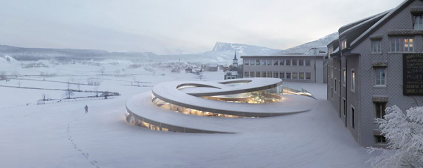
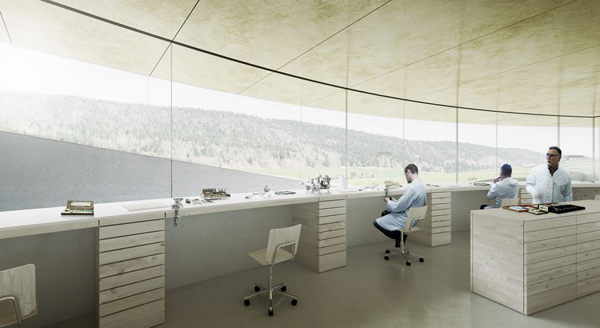
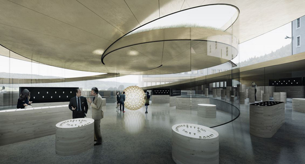
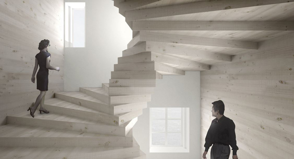
BIG’s addition to the Maison des Fondateurs will be located among of the historical complex of workshops and factories in Le Brassus, Switzerland, in the heart of La Vallée de Joux. Its organization and architecture embodies the core values of Audemars Piguet. It had to be characterized by the independent spirit of the family owned company that has retained autonomy over the years, making it a game changing innovator in a field governed by rules and traditions.
This spiral proposal is rooted in the heritage of watch-making in La Vallée de Joux that goes back centuries and is nested in the nature and culture of the place and the people of the valley. And finally it had to incorporate the inner tension that characterizes Audemars Piguet and resonates throughout the brand, the craft and the designs as captured in the motto – to break the rules you must first master them. La Maison des Fondateurs is conceived as an oxymoron, striking but subtle, contemporary yet timeless. Functional and sculptural. Floating yet rooted. Local presence with a global resonance.
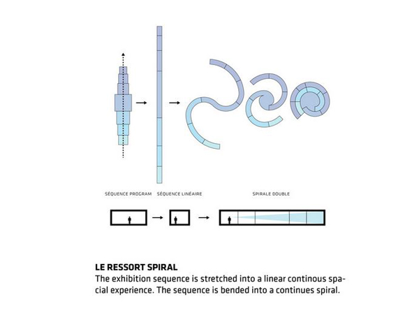
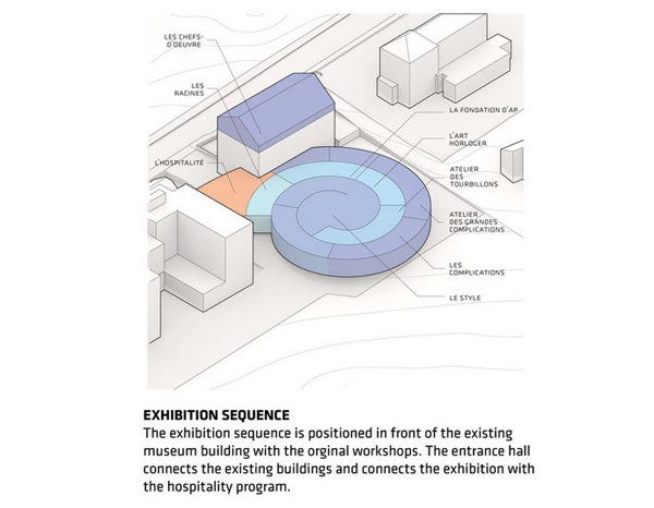
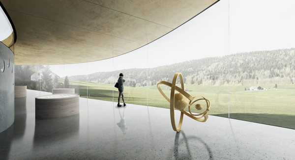
The spiral landmark is seamlessly integrated in the local landscape. The architecture aimed to be contemporary yet timeless in order to blend with the historical buildings and to create an intuitive sequence of spaces – old and new. A pavilion for the art and science of watch making is conceived as storyline for the visitors – every element governed by the functional requirements of the exhibition, appears as a striking sculpture conceived in a single gesture.
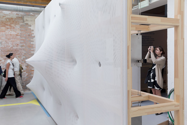
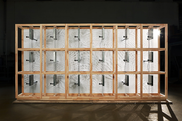
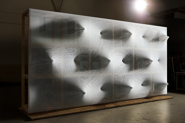
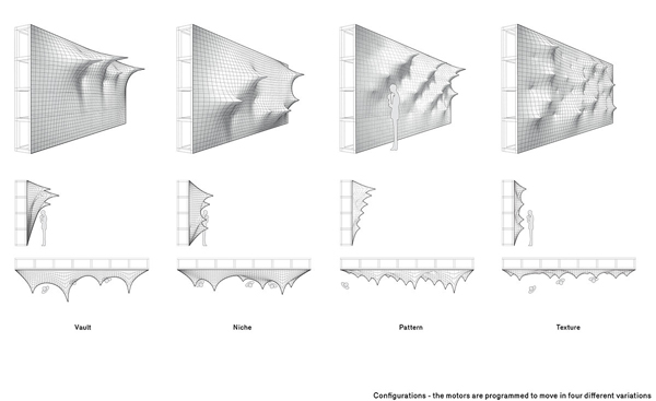
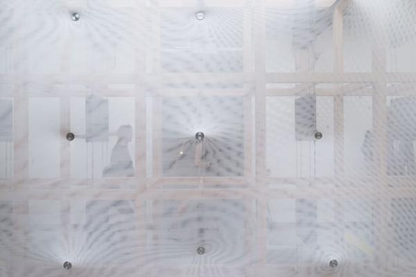
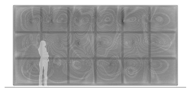
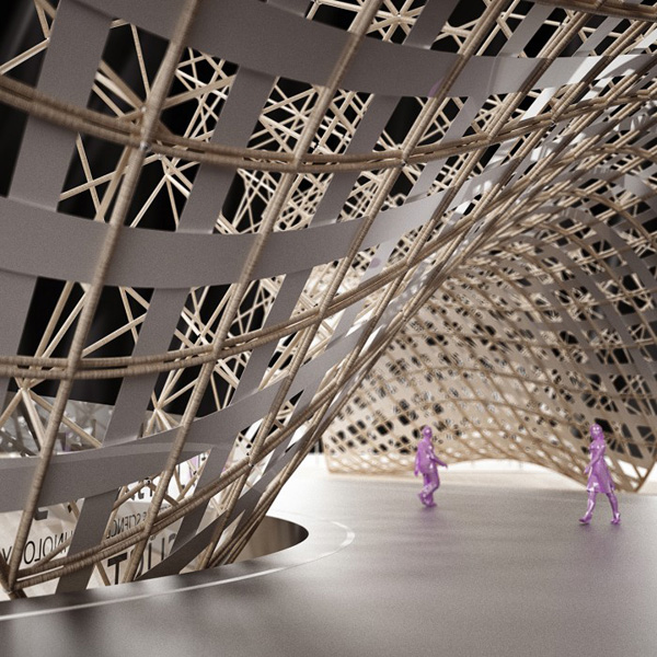
Barkow Leibinger’s “Kinetic Wall” is a prototype created for the 14th International Architecture Biennale „Fundamentals“ in Venice. The installation revisits the utopian dream of an architecture that can move, kinetically, first realized in the 20th century through modernism. This addition culminates an historical evolution of wall making – stone, brick, wood, glass partition, in the context of the Wall Room at the „Elements of Architecture“exhibition.
Surface – the wall – movement is activated by a series of motorized points which extend and retract that transform an elastic translucent synthetic fabric into a topographical section of peaks and valleys. This movement transforms the exhibition visitor’s corridor between the “Kinetic Wall” and the adjacent glass partition wall into a differentiated arch-like space. The limited and changing width of the passage ensures an immediate, intimate, and corporal relationship with the viewer-visitor. A digitally controlled choreography enables endless surface patterns, which emerge slowly then recede and change. This visual- surface effect is further enhanced by the two layers of grid fabric which when shifted over each other produce a moiré effect, a second scale of movement that is translucent and ephemeral.
This surface supported by a space frame containing a mechanical plenum produces a new kind of malleable poché – a material thickness. The lightweight laminated timber scaffolding – space frame is an anchoring framework for the fabric and houses the mechanisms that activate the surface. The wall has an apparent front and back but one where both sides of the skin are visible simultaneously. A “Kinetic Wall” offers an alternative future, an architecture that is materially and spatially dynamic of both natural and syntheticand recycled materials.
Photographer Brendan Fitzpatrick whose floral x-rays we first featured back in 2012, just released three new collections of x-ray photos including toys, creatures, and a new set of flowers, as part of his Invisible Light series. The photos are created with the help of a standard x-ray machine, but are artificially colored to help distinguish different materials. Prints of almost all of the images are available through Behance.
Photographer Chris Morgan snapped these great macro shots of hummingbirds in 2011 at Bosque De Paz, a 3,000 acre privately-owned biological reserve in the middle of Costa Rica. The top photo is a Green-Crowned Brilliant, a bird that only grows to a length of 13cm and is not known for its ability to sit for portraits. You can see more of Morgan’s bird photos here. (via Lost at E Minor)
If you are tired of putting normal sugar cubes in your morning cup of coffee, there’s a new alternative to make your experience that much more exciting: 3D printed sugar cubes. Yes, they are super sweat. Created by the Sugar Lab team at 3D Systems, the cubes come is a variety of unusual shapes, sizes and tasty colors.
The team is using the 3D Systems Chefjet printer to create each edibles treat. The Chefjet comes with various printable materials and flavors, such as chocolate, mint, vanilla and watermelon. If you want some cool sugar cubes for your wedding or next social event, they are for sale in limited quantity at Cubify.
If you’re interested in more ways 3D printing is hitting the kitchen, NPR put out an excellent article earlier this year.
You’re probably familiar with the 3rd person view in all sorts of video games… even Mario Kart used it. With a viewpoint placed just behind and above the character you’re playing, it gives you a clear understanding of where you are in a virtual space – something a first person view doesn’t always communicate so clearly. Now, two Polish designers have created that unusual perspective in real life – thanks to an Oculus Rift, and two GoPros mounted high on a custom backpack.
What makes the unusual device so interesting? Besides looking in the mirror, when was the last time you saw yourself from another viewpoint – at the moment it was happening? The unusual perspective given by their prototype is one of very few ways to have a real-time, three-dimensional out of body experience. Even if you’re not a gamer, that’s going to be one fascinating view.
Material Minds, presented by ArchDaily Materials, is our new series of short interviews with architects, designers, scientists, and others who use architectural materials in innovative ways. Enjoy!
Wood. The United States is the largest producer of the natural resource in the world. But yet we rarely see it in commercial, high-rise construction. So we asked a wood expert – Rebecca Holt at Perkins+Will, an analyst for reThink Wood‘s recent Tall Wood Survey – to tell us about its potential benefits.
AD: Why is wood a material architects should use in taller buildings?
There are lots of reasons to consider wood – first it has a lower environmental impact than other traditional choices like concrete and steel. Wood is the only major building material that is made the by sun and is completely renewable.
In North America, forest management is strongly regulated to ensure that forests are legally harvested and managed to meet society’s long-term demand for forest products. Wood products have less embodied energy, are responsible for lower air and water pollution, and have a lighter carbon footprint than other commonly used building materials.
Wood can significantly impact the quality of space – on the interior and exterior. People typically describe spaces that include exposed wood as warm and inviting. People tend to have strong, positive reactions and connections to spaces with wood. This was certainly emphasized by reThink Wood‘s Tall Wood Survey participants as an important reason for choosing to work with wood. Faster construction times – many of the mass timber products lend themselves well to prefabricated components, which make for quick installation and assembly which have a number of advantages – cost savings in a shorter construction schedule, advantageous for dense urban sites, with little space to store components – components can arrive on site ‘just in time’ and be erected/installed immediately. A timber structure offers a cleaner, drier, healthier working environment for the construction team. Finally, it’s important to consider timber where it make sense and use it appropriately (as it is with any material).
AD: What are the environmental benefits of using wood?
I think there are several issues to consider, certainly it’s a low carbon material. [...] In addition, one of the most consistent messages from Survey participants is that a wood solution is integral and complementary to goals of optimizing energy performance and creating high quality spaces for occupants. Wood was noted as beneficial in contributing to good envelope performance; as a poor conductor of heat, it minimizes thermal bridging, improving the effectiveness of the insulation compared to other materials. In addition, several Survey participants emphasized the complementary advantage of achieving good air tightness afforded by the precision cut and fit of prefabricated panel components, with less joints, gaps and penetrations to seal as compared to other materials/systems – aligning well with the Passive House standard. It must also be emphasized that wood contributes significantly to a healthy indoor environment and high quality spaces that foster a sense of well-being.
AD: How exactly does a wooden building sequester carbon?
Trees naturally absorb carbon dioxide from the atmosphere, incorporating it into their wood, leaves, needles, roots and surrounding soil (a carbon sink). That carbon is only released when the wood begins to breaks down. Wood products sequester stored carbon, keeping it out of the atmosphere for the lifetime of the structure — or longer if the wood is reclaimed, reused and manufactured into other products. It is important that forests are maintained responsibly to manage the balance between carbon sink and storage and of course, a healthy ecosystem.
AD: Cross-Laminated-Timber (CLT) and other innovations allowed buildings to become taller; what is the structural height limit or capability of wood?
While the tallest building included in the Survey (and the tallest completed project to date) is 10 levels – Forte in Melbourne, Australia – all participants were confident that the height limit of timber buildings could certainly be much taller. The Survey showed a temporal trend toward refined design and construction solutions, so as more techniques are applied and tested, I expect heights will grow. In addition, Survey respondents identified market acceptance as an important part of growing the market for taller wood buildings – there is work to do to change perceptions of fire risk and durability.
AD: One thing people assume about wood is that is less resistant to fire than a material like steel, which isn’t necessarily true. What steps do you take to fire-rate a tall building?
Structural or mass timber products like CLT or LVL have an inherent resistance to fire. Wood burns slowly and the char layer created on the surface as it burns helps protect and insulate unburnt wood below the charred layer. The unburnt portion of a thick member retains 85-90% of its strength. In addition, timber panel products can eliminate void spaces between walls and floors where fire tends to spread easily, making it more fire resistant than other construction material/methods. Fire protection strategies vary depending on the type of timber products used and the requirements of the jurisdiction. Among all the projects surveyed, timber elements were oversized to include a char layer, in addition to encapsulating timber elements with gypsum to some degree. Sprinkler systems and intumescent paint applied to exposed timber were also common fire protection strategies.
AD: Moisture damage can be an issue in wooden structures. How do you prevent moisture damage on a large scale project?
In all cases, any exposed structural wood elements are located either inside the building envelope, protected by an overhang or in the case of cantilevered panels, exposed only on the underside [...,] as with any building or material, the qualities and capabilities of wood must be respected, and buildings must be well maintained to ensure long term durability. During operation, moisture is addressed in most cases by a mechanical ventilation system, but Survey participants all emphasized the importance of educating building occupants on optimal operation strategies. To address the perception that moisture could be a concern, two of the buildings in the Survey have installed moisture sensors within the building envelope to monitor performance over the long term (Limnologen, Forte).
AD: What are the financial benefits of using wood in larger scale buildings?
The Survey results emphasized the benefit of shorter construction schedules where prefabricated elements were used. Survey participants noted that the quality of construction was superior in most cases, resulting a more durable building and better long term investment. Operational energy savings as identified in question 2 certainly contributes to building the financial case. At least two of the projects in the Survey set out to demonstrate that a timber structure could be construction cost competitive with a concrete structure and were successful.
AD: Is there a specific reason tall wooden structures are more prevalent in European countries than in the USA?
There is a strong regulatory grounding in Europe where governing policies in support of low carbon construction, energy efficiency, or renewable resources, directly or indirectly encourage tall wood and mass timber construction. As well, expertise across related sectors appears to have benefited from a greater blending of professional roles, creating a strong culture of collaboration between developers, designers, timber fabricators and researchers. These nuances appear to be significant for advancing strong and credible markets for tall wood construction, and are only just beginning to emerge in North America.
AD: Lastly, what are some striking examples of vertical wooden buildings?
The interesting thing about most of the buildings that participated in the Survey, is that most don’t appear from the exterior to be wooden buildings. In almost all cases the wood is hidden in the structure and only exposed on the interior – if at all. Where the wood is featured, is where it makes the most striking impact, and there are several beautiful examples in our Survey participant projects: The Tamedia building features the timber structure on the interior in a very modern way. The interior suites of 3XGrun and Forte are lovely, inviting and warm residential spaces. The LCT ONE office space is beautiful – having spent a day working in the building myself, I can attest to the sense of well-being afforded by the timber elements in the finished space. The feature timber stair at the Earth Sciences Building is certainly a striking signal of the timber elements within the structure of the academic wing.
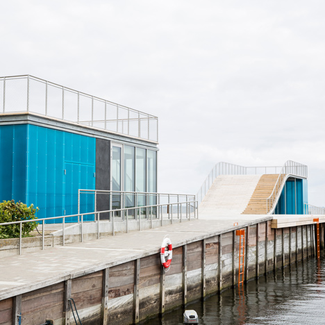
A team led by JDS Architects has created a waterfront recreation area for the Danish seaside town of Faaborg where swimming areas sit between piers and decked surfaces curve up over small buildings (+ slideshow). (more...)
I don’t know if you’re into cycling but looking through Neil Stevens’ portfolio it’s pretty clear that he is! His Spring Classic series is a wonderful celebration of the races that are held each year in France, Belgium and the Netherlands; and even if cycling isn’t really really thing I’m pretty sure you’ll love these.
The races themselves date back to the 1890′s, featuring steep climbs, cobbled stones and long distances. Neil’s prints make it look like a charming old time, but in truth it’s a long, gruelling and tough race.
Neil is based in in St Albans and London, where he creates illustrations, prints and posters. Prints from his Spring Classic Cycling series are currently available from his online shop. Go check them out!
If you’re afraid of heights, caves, the dark, suffer from claustrophobia or vertigo, this might not be for you, but if not, a small Welsh town has the perfect subterranean adventure for you: the world’s largest underground trampoline. Just unveiled in Blaenau Ffestiniog, North Wales, Bounce Below is a network of trampolines and slides mounted to the walls of an abandoned slate mine at heights of 20 feet to 180 feet off the ground. Visitors are welcome to climb, bounce, slide, and jump in the netting amidst a technicolor light show. Tickets are available online and the space will open to the public July 4th, 2014. (via My Modern Met)
In 2011, Dublin-based physics student David Whyte began a Tumblr called Bees & Bombs where he posted humorous images and quirky GIFs of his own creation, borrowing heavily from videos and pop culture icons. One day he decided to start playing with Processing, a popular open source programming language designed to help create images, animation, and various computer interactions. His background in mathematics and physics greatly enhanced his understanding of motion and geometry and it wasn’t long before he was churning out some of the most popular animations shared on Tumblr.
Whyte’s minimalistic use of shapes and color places an increased emphasis on motion, and leaves one somewhat dumbstruck at how he conceives of each image. In a somewhat rare move he happens to be quite open about his methods and frequently posts source code and tips to help other artists. See much more of his work on Bees & Bombs.
To explore the photography of French art director and concept designer Nicolas Bouvier is to become lost in strange new world, the inhabitants of which are dwarfed by the towering silhouettes of tree and mountains, or swallowed completely by eerie fog and haze. Though these landscapes are indeed real, shot in locations mostly in the Pacific Northwestern U.S., it may not be surprising that Bouvier’s day job is pure science fiction: he creates stunning concept art and illustrations for video games like Halo and Assassin’s Creed. While his concept art has gathered wide acclaim (he’s currently publishing a third book of his own illustrations), his photographic work has also flourished, garnering a significant following over on Flickr. We’ve featured his images several times right here on Colossal as part of our Flickr Finds series.
Currently based in Seattle, Bouvier first picked up a camera in the 1990s while in school, but it wasn’t until 2007 that he began shooting again in earnest. He has since amassed a collection of nearly two dozen cameras (he mentions he picked up a Lumix ZS40 just yesterday), all of which he experiments with as he explores locations around California, Washington, Oregon, Mexico, and France with his family who often appear as subjects in his surreal photos.
It was nearly impossible to make a selection of work for this post, so I strongly urge you to click this link, grab some coffee, and then press the right arrow on your keyboard about 1,100 times. You won’t regret it.
Has a wobbly head like the wobble-head figurines. The lampshade is fixed by a vacuum cup. In the base there is a magnet that connects with a separate magnet that you mount under the tabletop for stability.
Wobbelhead Lamp, by Morten & Jonas
Photography by Montag
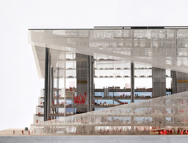
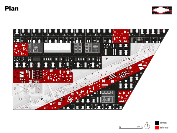
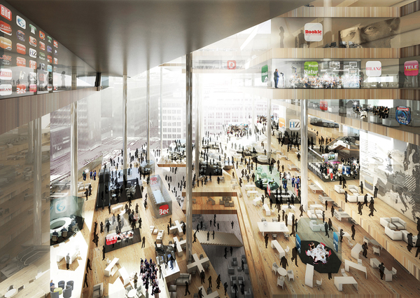
The winner is revealed – OMA won the final round of a public design competition for Axel Springer’s new media center in Berlin. The building aims to create new hub in the existing campus in central Berlin. As seen in Axel Springer, the winning design presented conceptually and aesthetically most radical model, while the fundamental innovation of working environments support the cultural transformation towards a digital publishing house.
The building will be located on one of the city’s most significant locations – the street previously separated East and West Berlin. The new office block is bisected by a diagonal atrium that opens up to the existing Springer buildings, an extension of the Springer campus. The essence of the proposal is a series of terraced floors that together form a ‘valley’. Each floor contains a covered part for formal work, which is then uncovered on the terraces to act as an informal stage and a place to broadcast ideas to other parts of the company. The ground floor is open to the city and contains studios, event and exhibition spaces, canteens and restaurants.
OMA’s winning design team is led by partners-in-charge Rem Koolhaas and Ellen van Loon, and project leaders Katrin Betschinger, Alain Fouraux and Betty Ng. The project was developed in collaboration with Chris Carroll from Arup London, Duncan Phillips from RWDI for microclimate consultation, Eckhard Kahle of Kahle Acoustics, Christian Wernicke and Christoph Winter of SMV Bauprojektsteuerung & Emproc GmbH for cost consultation, and Peter Stanek for fire safety consultation.
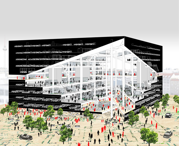
OMA won the final round of a public design competition for Axel Springer’s new media centre in Berlin. The building aims to create new hub in the existing campus in central Berlin. As seen in Axel Springer, the winning design presented conceptually and esthetically most radical model, while the fundamental innovation of working environments support the cultural transformation towards a digital publishing house.
The building will be located on one of the city’s most significant locations – the street previously separated East and West Berlin. The new office block is bisected by a diagonal atrium that opens up to the existing Springer buildings, an extension of the Springer campus. The essence of the proposal is a series of terraced floors that together form a ‘valley’. Each floor contains a covered part for formal work, which is then uncovered on the terraces to act as an informal stage and a place to broadcast ideas to other parts of the company. The ground floor is open to the city and contains studios, event and exhibition spaces, canteens and restaurants.
OMA’s winning design team is led by partners-in-charge Rem Koolhaas and Ellen van Loon, and project leaders Katrin Betschinger, Alain Fouraux and Betty Ng. The project was developed in collaboration with Chris Carroll from Arup London, Duncan Phillips from RWDI for microclimate consultation, Eckhard Kahle of Kahle Acoustics, Christian Wernicke and Christoph Winter of SMV Bauprojektsteuerung & Emproc GmbH for cost consultation, and Peter Stanek for fire safety consultation.
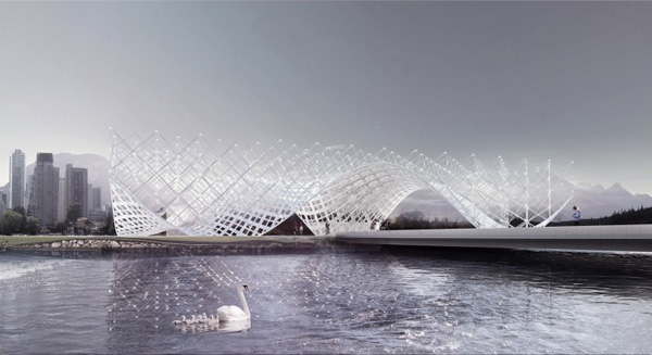
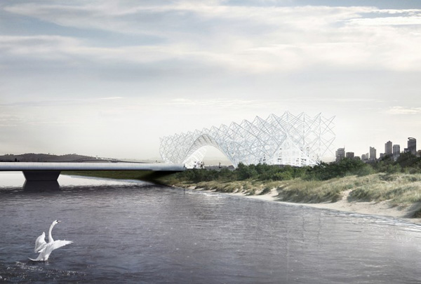
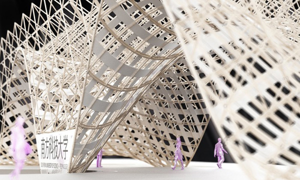
Between Earth and Sky Gate by Penda Design is the design for an entrance sculpture to the Shenzhen Southern University of Science and Technology. It is a metaphor of formal contrasts to design a campus landmark. There is a Chinese saying parents tell their children when they leave home for university, which means roughly translated: “ride on the wings of an eagle to your success”. Therefore the wing-shaped design for the sculpture is a formal translation of this saying.
The sculpture serves as an entrance gate and is a connection of two opposites: the fluid, lower part connects the gate to the gentle hills of the landscape in the background and carries a grid of lights, which can be seen as a connection to the cosmos – a contrast of the earth and the sky. Furthermore the landmark should symbolize a freedom of thinking on one hand and certain guidelines on the other hand, which stand for a system and order in science – a contrast of endless possibilities and technical limitations. With those opposites, the sculpture describes what a modern Technical University should stand for – a symbiosis of nature and technology.
Penda Design is a young office, established in 2012 and located in Vienna and Beijing. Their credo is to see architecture as a statement that always starts with questions about the content and the context, about identity, density and the community of a specific site. The office is formed by Chris Precht and Dayong Sun.
Tom Chambers is an American photographer who creates intriguing photomontages which hint at strange stories and magical unspoken tales. His series Animal Visions is a wonderful example of what he does so well. Focusing on his fascination with the animal kingdom, this work explores the relationships and connections between people and animals and creates wonderful images that are surreal and beautiful.
“While working on Animal Visions I found myself circling back to the influence of magic realism” says Chambers. “In the early 20th century Latin American writers and artists used magic realism to create images, which with a simple twist go beyond the expected into the unexpected.”
Chambers goes on to explain that the series aims to tell unfinished stories, tales which may initially seem true or believable but, most likely are improbable. It’s a wonderful collection of images and the full series is well worth checking out.
You can see more work from Chambers on his website here.
T Magazine visited the Milan Furniture Fair last week and rounded up their three favorite designers from the show. The one that caught my eye was Ferréol Babin’s lamp titled Lunaire which looks utterly unreal, which you can see above. I love this piece because it reminds me of some celestial formation in space, like something you might see on Cosmos.
Babin says much of his work revolves around one central question: “How can an object produce a strong effect, an impressive impact, and then turn into a quiet and nonintrusive object when we want it to? That’s why light is my favorite ‘material,’ because it has this power to change a whole room in a second.”
I don’t know much about Typical Hope but boy do they know how to make excellent GIFS! Started earlier this year, the blog currently has about 25 small animated loops on it and I’m looking forward to watching it grow over the next few months.
Each GIF is made using traditional animation, Photoshop or After Effects and the work has a wonderful variety to it. What strikes me most about it is just how striking a simple item or scene can become with just the right amount of animation. A doughnut or a cup of coffee for example becomes a beautifully hypnotic image with just the right amount of animated flourish. I love it! And the color choices are just perfect too.
You can see more work from the mysterious Typical Hope by checking out their Tumblr here.
German based watchmakers NOMOS Glashütte are known for their high caliber of watchmaking and this video proves it. Aptly titled Look over the watchmakers’ shoulder we get an intimate look at the intricate process that goes into the making of a watch. It’s honestly mind-boggling to think of how confident these makers are at creating something with such small scale. I think it also clearly shows why these watches are so expensive: it takes a lot of work to make something so perfect.
It’s always fun to see new takes on an old classic, and the makers of Cylo, a well-designed, urban bike, have certainly made their mark. Based in Portland, Oregon Cylo is an effort to create a bike that’s both stylish and functional while at the same time a bike that’s easy to hop on and go.
We grew up in a small town where we could do everything by bike. Once we got our first jobs in bigger cities like New York, London, Berlin, and Portland, we kept on cycling. There is nothing on the market today that answers the rigorous needs of the city with an iconic design for today. Our mission is to build beautiful bicycles that you can simply jump on and ride without having to think.
Though they’re still figuring out the full details of the bike you can see from their renderings that this has a lot of engineering love. I love that the bike has integrated lights, it’s made from aluminum so it’s nice and light, and it uses a carbon belt drive which is both rugged and won’t get your pants dirty. They’re estimating a release of the bike for this summer, so if you’re interested you should visit their site and put yourself on the waitlist.
Can creativity change the world? Advertising agency DDB NY would like to think so, as demonstrated in their new campaign for the Smithsonian National Zoo, the Endangered Song. In an effort to spread awareness of the less than 400 Sumatran Tigers left in the world, the two teamed up with rock band Portugal. The Man to manufacture and record a song. Not just any ol’song, but one created to go extinct, unless digitally reproduced. It’s a wholly clever solution, reminding us of creativity’s importance and influence. I was afforded the opportunity to pick the brains of the two creatives behind it all to find out more.
Portugal. The Man’s track—”Sumatran Tiger”—does not officially exist in the digital world. Although if you were to google it, you’d discover otherwise. Each result is in fact a copy, transferred from one of the original 400 vinyl records that was seeded to industry influencers. The Endangered Song is a clever metaphor, reflective of the tigers’ current circumstances. It’s a wildly creative means to raising funds and awareness for the species. I also feel this idea is neat in that it’s of the times (Wu Tang’s “one copy song” anybody?) and mixes emerging and traditional media to lend aid to a big problem.
The record’s lathe-cut polycarbonate production ensures that they will eventually degrade and go extinct if not copied digitally. The design and messaging works twofolds, communicating the aforementioned but also a slew of other information. A difficult task but executed exceptionally well. I could go on and on, but figured there’s probably more to learn from the creatives who managed it themselves. I spoke to the creative duo at DDB, Art Director Michael Kushner and copywriter Daniel Paredes, to discover more about the design as well as the process behind the project.
Why did you guys choose music to save Sumatran Tigers?
We think that the best ideas come about when you pull from all kinds of inspiration that speaks to you as a creative, and then try to mix it in a way that is fresh and authentic.
This project is closely linked to the music industry. How much does music inspire you as creatives on a daily basis?
Music is a huge inspiration, and it seems to be inherent in pretty much everything in our industry. We look to music videos a lot. We’re huge fans of Jonathan Glazer for example.
Did Portugal. The Man and the “Sumatran Tiger” song they created influence the look and feel? What came first: logo or the song?
The song and band definitely came before the design. We wanted to stay true to their vibe, while also incorporating the Smithsonian National Zoo in a science and preservation way. At the end of the day though, the record had to be more than something that people would just throw out when they received it—so it needed a lot of design to achieve an appealing aesthetic.
Can you lend some thoughts to the Endangered Song’s overarching design?
We wanted to make the album artwork look and feel hand crafted because of the indie/grassroots nature of the project. There are many blemishes and imperfections, but those imperfections still have to look good. That’s where designers like John Contino come in for great inspiration. The key objectives were first and foremost to communicate the project to whomever would be receiving the record in the mail, and then to make the artwork representative of extinction.
Looking to nature for inspiration is no new concept, considering your product was essentially a Tiger, did it have an influence on the design?
Well, when designing the “teeth” logo, it had to be 100% accurate or else the Smithsonian National Zoo would not approve. So we took a picture of Sumatran Tiger teeth, and used it for the outline of the teeth. Otherwise, and it might be a stretch, but the entire idea is an example of biomimicry, in a social experiment sort of way: “Social biomimicry.” We took the idea of a species essentially having a half-life, and applied that to music. Thinking about never being able to hear a certain song again paints a certain picture, and hopefully gets one thinking about how much worse it could be to never again see or interact with an actual species again.
A logo. We all understand one’s importance. What were you trying to communicate with the Endangered Song’s symbol?
The “teeth” logo on the front was made to look like fossils representing extinction. The record sleeve’s “glitched” backside tiger was created by taking a stock image and manipulating it to represent reproduction and copies of a copy. The line-art tiger was meant to represent an encyclopedia image of a Sumatran Tiger, one that you might find of an extinct animal. Everything borrowed little bits from everywhere relevant.
The last question I asked Dan and Mike was a loaded one, that if they believe creativity has the power to change the world. Mike responded with an affirmative “Absolutely.” But then continued (half jest, half serious), “think about Bagel Bites. Pizza. On a Bagel. I mean, holy cow. And that was like 15 years ago.”
Jokes aside, I think they’d agree with me that creativity can in fact make a difference in the world, and that it certainly has. Advertising tends to come off as the naughty [read: corporate] bunch of the creative industries, but when you look at campaigns like the Endangered Song, can you still assert so? I hope not. At the end of the day, thanks to a creative solution and a tactful execution, people who otherwise wouldn’t be talking about Sumatran tigers now are. There’s nothing but good in that.
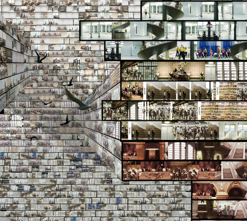
From the New World, 13′ x 26′ (400cm x 800cm), Epson Ultragiclee print on Epson fine art paper
From the New World, detail
From the New World, detail
From the New World, detail
From the New World, detail
From the New World, detail
From the New World, detail
From the New World, detail
In his largest artwork to date, Chinese artist Yang Yongliang (previously here and here) just unveiled From the New World, a sprawling digital collage depicting an overpopulated, futuristic landscape completely overrun with construction, debris, and high-rise skyscrapers. The new artwork is a continuation of Yongliang’s ongoing commentary about the devastating effects of unchecked development and industrialization through the use of dense, photography-based collage. From the New World measures almost 26 feet wide (800cm) by 13 feet tall, and while it’s impossible to truly appreciate it online, you can see many more detail shots over on his website.
Taking architecture into the 4th dimension, Axel de Stampa has created animated GIFs featuring some of the world’s most famous contemporary buildings. It’s a playful and mind bending experiment in architectural remixing.
Starting with an image of the original building, Stampa replicates, warps and redistributes elements found in the design language of each. He does such an incredibly good job fooling the eye, that even those familiar with the iconic structure could be left wondering if they’ve remembered it correctly.
The series of animations is part of Stampa’s ambitious 1 Week 1 Project. A “spontanious architecture” experiment where he and Sylvain Macaux (both architectural graduates from the Ecole d’Architecture de Paris-Belleville) attempted to create one new architectural idea per week in 2013. They’ve now continued the project with a less demanding ideation schedule and this is just one example of the results.
Can you figure out the original state of each structure? Click “original” to see an image of the building in static, real-life.


