Ever since iOS 11 came out I had experienced a significant
performance issue on my iPhone 6S. Animations and transitions were
slow, app loading was noticeably and unbearably slower than iOS 10
and my battery was draining faster. Many rumours swirled that
others were experiencing this but not all.[…]
Then several weeks ago a Reddit conversation started spreading
online that presented possible evidence Apple was reducing the
performance of their iOS and possibly laptops when the battery
life was sufficiently degraded. That day I decided to test the
theory by getting my battery replaced at the Apple Store.
[…] After I confirmed with her that I was not using it that
heavily and the battery setting statistics also didn’t show an
application using a large percentage of the battery she suggested
a rogue system process that somehow persisted through upgrades and
restarts.
She also let me know that my battery was at 83% health and that
Apple won’t even do a replacement unless it’s below 80%.
So I went home and immediately did a local backup, wipe and
restore. And voila! Performance issues were gone.
Again I say, if “everything” is slow on your iPhone, it’s probably not this issue related to older batteries. A full backup and restore is a pain in the ass, but it’s worth trying. There are clearly some bugs in iOS 11 that triggered such problems in far too many devices.
No one wants friction in their products. Everyone works to reduce it. Yet it sneaks in everywhere. We collectively praise a service, app, or design that masterfully reduces friction. We also appreciate minimalism. We love when products are artfully distilled down to their essence. How do we achieve these broadly appreciated design goals?
Frictionless and minimalism are related but not necessarily the same. Often they are conflated which can lead to design debates that are difficult to resolve.
A design can be minimal but still have a great deal of friction. The Linux command line interface is a great example of minimal design with high friction. You can do everything through a single prompt, as long as you know what to type and when. The minimalism is wonderful, but the ability to get going comes with high friction. The Unix philosophy of small cooperating tools is wonderfully minimal (every tool does a small number of things and does them well), but the learning and skills required are high friction.
Minimalist design is about reducing the surface area of an experience.
Frictionless design is about reducing the energy required by an experience.
When debating a design choice, feature addition, or product direction it can help to clarify whether a point of view originates from a perspective of keeping things minimal or reducing friction. If people discussing a decision start from this common understanding, I bet a decision will be reached sooner. Essentially, is the debate about adding a step or experience fork, or is it about adding something at all?
Product managers need to choose features to add. That is what makes all of this so difficult. As great as it is to stay pure and within original intent, if you and the team don’t enhance the capabilities of your product then someone will do what you do, but with a couple of more things or a different factoring and you’ll be left in the dust.
Therefore the real design challenge is not simply maintaining minimalism, but enhancing a product without adding more friction. Let’s assume you built a product that does something very exciting and has a very low friction to usage and does so with a minimal feature set. The next efforts are not about just watching your product, but about deciding how to address shortcoming, enhance, or otherwise improve the product to grow users, revenue, and popularity. The risk with every change is not simply failing to maintain minimalism, but introducing friction that becomes counterproductive to your goals.
When you look back you will be amazed at how the surface area of the product has expanded and how your view of minimalism has changed. Finding the right expression of new features such that you can maintain a minimalist approach is a big part of the design challenge as well.
There’s an additional design challenge. The first people who use your product will likely be the most enthusiastic, often the most technical, and in general the most desirous of features that introduce friction. In other words you will get the most positive feedback by adding features that ultimately will result in a product with a lot more friction.
Product managers and designers need to find the right balance as the extremes of doing nothing (staying minimal) and listening to customers (adding features) will only accelerate your path to replacement either by a product with more features or a product with less friction.
Low-Friction Design Patterns
Assuming you’re adding features to a product, the following are six design patterns to follow, each essentially reducing friction in your product. They cause the need to learn, consider, futz, or otherwise not race through the product to get something done.
Decide on a default rather than options
Create one path to a feature or task
Offer personalization rather than customization
Stick with changes you make
Build features, not futzers
Guess correctly all the time
Decide on a default rather than options. Everything is a choice. Any choice can be A/B tested or debated as to whether it works or not. The more testing you do the more likely you are to find a cohorts of people who prefer different approaches. The natural tendency will be to add an option or setting to allow people to choose their preference or worse you might interrupt their flow to ask preference. Make a choice. Take a stand. Every option is friction in the system (and code to maintain). When we added the wheel to the mouse in Office 97 there was a split in the team over whether the wheel should scroll down or whether it should zoom in/out. From the very first release there was an option to appease the part of the team that felt zoom was more natural. Even worse, the Word team went and did a ton of work to make zoom performant since it was fairly unnatural at the time.
Create one path to a feature or task. You add a new feature all is good — you’re in X in your product and then you can do Z. Then someone points out that there are times when you are doing Y in your product and you also want to do Z. Where there was once one path to get to a feature you now think about adding a second path. Maybe that sounds easy enough. Then a few iterations down the road and you have 5 different ways to get to Z. This whole design process leads to shortcuts, floating buttons, context menus, and more. Again all of which are favored by your early adopters and add friction for everyone else, and also add code. Pick the flow and sequence and stick with it. The most famous debate of all between Windows and Mac was over right click and it still rages. But the design energy to populate context menus and the cognitive load over knowing what you can or cannot do from there is real. How many people have right clicked on a file in the Windows desktop and clicked “Send” only to be launched into some Outlook configuration dialog when it would have been frictionless to always know that insert attachment in mail works and nothing will fail.
Offer personalization rather than customization. Early adopters of a product love to customize and tweak. That’s the nature of being a tech enthusiast. The theory is that customization makes a product easier to use because every use case is different enough that the time and effort saved by customization is worth it and important. In managing a product over time, customization becomes an engineering impossibility to maintain. When you want to change behavior or add a feature but it isn’t there or moved you introduce an engineering impossibility. The ability in Office to reorganize all the toolbars and menus seemed super cool at the time. Then we wanted to introduce a new scaleable structure that would work across resolutions and input devices (the ribbon). The problem was not just the upgrade but the reality that the friction introduced in using Office by never knowing where the menus might be (at the extreme, one could open a document that would rearrange the UX) was so high the product was unusable. Enterprise customers were rearranging the product such that people couldn’t take courses or buy books on how to use Office. The constraint led to the addition of a single place for personalization (Quick Access Toolbar) which ultimately allowed for a much lower friction design overall by enabling personalized efficiency without tweaking the whole experience.
Stick with changes you make. The ultimate design choice is when you change how a feature used by lots of customers works. You are choosing to deliberately upend their flow and add friction. At the same time the job of designing a product is moving it forward to new scenarios and capabilities and sometimes that means revisiting a design choice perhaps one that is the standard. It takes guts to do this, especially because you’re not always right. Often the path is to introduce a “compatibility mode” or a way to turn your new product into the old and comfortable product. This introduces three problems. First, you have to decide what the default will be (see the first rule above). Second, you have to decide if/how to enhance the old way of doing things while you’re also adding new things. Third, you have to decide when down the road you remove the old way, but in reality that will be never because you already told customers you value it enough to keep it around. But adding compatibility mode seems so easy and customer friendly! Ultimately you’re creating a technical debt that you can never dig out of. At the same time, failing to make big changes like this almost certainly means your product will be surpassed in the marketplace. See this HBS case on the Office 2007 Ribbon design http://www.hbs.edu/faculty/Pages/item.aspx?num=34113 ($).
Build features, not futzers. Tools for creativity are well-known to have elaborate palettes for formatting, effects, and other composition controls. Often these are built on amazing “engines” that manage shapes, text, or image data. Historically, tools of creativity have prided themselves on exposing the full range of capabilities enabled by these engines. These vast palettes of features and capabilities came to define how products and compete in the marketplace. In today’s world of mobility, touch interfaces, and timely/continuous productivity people do not necessarily want to spend time futzing with all the knobs and dials and seek to minimize time from idea to presentation — call this the Instagram effect. Yet even today we see too many tools that are about debugging your work, which is vastly different than getting work done. When a person needs a chart, a table, a diagram or an image how can you enable them to build that out of high-level concepts rather than the primitives that your engine supports? I was recently talking to the founder of an analytics company struggling with customer input on tweaking visualization which was adding complexity and taking engineering time away from adding whole new classes of visualization (like maps or donut charts). You’ll receive a lot of input from early customers to enable slightly different options or adjustments which will both challenge minimalism and add friction to your product without growing the breadth of scenarios your product enables. Staying focused on delivering features will enable your product to do more.
Guess correctly all the time. Many of the latest features, especially those based on machine learning or statistical models involve taking action based on guessing what comes next. These types of features are magical, when they work. The challenge is they don’t always work and that drives a friction-filled user experience. As you expand your product to these areas you’re going to want to find the right balance of how much to add and when, and patience with guessing too much too soon is a good practice. For better or worse, customers tend to love features that guess right 100% of the time and even if you’re wrong only 1% of the time, that 1% feels like a much higher error rate. Since we know we’re going to be learning and iterating in this regard, a best practice is to consider how frictionless you can make incorrect guesses. In other words, how much energy is required to skip a suggestion, undo an action, or otherwise keep the flow going and not stop to correct what the software thought was right but wasn’t. Let’s just call this, lessons from “bullets and numbering” in Word :-)
Finally, a word of caution on what happens as you expand your customer base when it comes to adding features. Anything you want to do in a product can be “obvious” either from usage data or from customer input. The challenge in product management is to create a core set of principles or beliefs about how you want to move the product forward that allow you to maintain the essential nature of your product while adding new features. The tension between maintaining existing customers via stability or incremental improvements versus keeping pace with where the marketplace is heading is the classic design challenge in technology products.
It shouldn’t be much of a surprise, but a great deal of product bloat comes from adding the obvious feature or directly listening to customers, or by failing to stick with design patterns. Ironically, efforts to enhance products for today’s customers are often the very features that add friction, reduce minimalism, and lead to overall bloat.
Bauhaus to Bloatware
This march from Bauhaus to Bloatware is well-known in our industry. It is part of a cycle that is very difficult to avoid. It is not without irony that your best and most engaged customers are often those pushing you to move faster down this path. Most every product in every segment starts minimal and adds features over time. At each juncture in the evolution of the product there is a tension over whether additions are the right marketplace response or simply bloat.
This march (and tension) continues until some complete rethinking introduces a new minimal product addressing most of the same need but from a different perspective. The cycle then starts again. Operating systems, databases, instruction sets, peripheral connection, laptops, interfaces, word processors, and anything you can name has gone through this cycle.
This re-evolution or reimagination of a product is key to the long term viability of any technology.
By adhering to a set of design principles you are able to expand the breadth of use cases your product serves while working to avoid simply adding more friction to the core use cases.
This article is a chapter from my new book Explain the Cloud Like I'm 10. The first release was written specifically for cloud newbies. I've made some updates and added a few chapters—Netflix: What Happens When You Press Play? and What is Cloud Computing?—that level it up to a couple ticks past beginner. I think even fairly experienced people might get something out of it.
So if you are looking for a good introduction to the cloud or know someone who is, please take a look. I think you'll like it. I'm pretty proud of how it turned out.
I pulled this chapter together from dozens of sources that were at times somewhat contradictory. Facts on the ground change over time and depend who is telling the story and what audience they're addressing. I tried to create as coherent a narrative as I could. If there are any errors I'd be more than happy to fix them. Keep in mind this article is not a technical deep dive. It's a big picture type article. For example, I don't mention the word microservice even once :-)
Netflix seems so simple. Press play and video magically appears. Easy, right? Not so much.
Given our discussion in the What is Cloud Computing? chapter, you might expect Netflix to serve video using AWS. Press play in a Netflix application and video stored in S3 would be streamed from S3, over the internet, directly to your device.
A completely sensible approach…for a much smaller service.
But that’s not how Netflix works at all. It’s far more complicated and interesting than you might imagine.
To see why let’s look at some impressive Netflix statistics for 2017.
Netflix has more than 110 million subscribers.
Netflix operates in more than 200 countries.
Netflix has nearly $3 billion in revenue per quarter.
Netflix adds more than 5 million new subscribers per quarter.
Netflix plays more than 1 billion hours of video each week. As a comparison, YouTube streams 1 billion hours of video every day while Facebook streams 110 million hours of video every day.
Netflix played 250 million hours of video on a single day in 2017.
Netflix accounts for over 37% of peak internet traffic in the United States.
Netflix plans to spend $7 billion on new content in 2018.
What have we learned?
Netflix is huge. They’re global, they have a lot of members, they play a lot of videos, and they have a lot of money.
Another relevant factoid is Netflix is subscription based. Members pay Netflix monthly and can cancel at any time. When you press play to chill on Netflix, it had better work. Unhappy members unsubscribe.
Netflix operates in two clouds: AWS and Open Connect.
How does Netflix keep their members happy? With the cloud of course. Actually, Netflix uses two different clouds: AWS and Open Connect.
Both clouds must work together seamlessly to deliver endless hours of customer-pleasing video.
The three parts of Netflix: client, backend, CDN.
You can think of Netflix as being divided into three parts: the client, the backend, and the CDN.
The client is the user interface on any device used to browse and play Netflix videos. It could be an app on your iPhone, a website on your desktop computer, or even an app on your Smart TV. Netflix controls each and every client for each and every device.
Everything that happens before you hit play happens in the backend, which runs in AWS. That includes things like preparing all new incoming video and handling requests from all apps, websites, TVs, and other devices.
Everything that happens after you hit play is handled by Open Connect. Open Connect is Netflix’s custom global content delivery network (CDN). When you press play the video is served from Open Connect. Don’t worry; we’ll talk about what this means later.
Interestingly, at Netflix they don’t actually say hit play on video, they say clicking start on a title. Every industry has its own lingo.
By controlling all three areas—client, backend, CDN— Netflix has achieved complete vertical integration.
Netflix controls your video viewing experience from beginning to end. That’s why it just works when you click play from anywhere in the world. You reliably get the content you want to watch when you want to watch it.
As Spotify continues to inch towards a public listing, Apple is
making a move of its own to step up its game in music services.
Sources tell us that the company is close to acquiring Shazam, the
popular app that lets people identify any song, TV show, film or
advert in seconds, by listening to an audio clip or (in the case
of, say, an ad) a visual fragment, and then takes you to content
relevant to that search.
We have heard that the deal is being signed this week, and will be
announced on Monday, although that could always change.
One source describes the deal as in the nine figures; another puts
it at around £300 million ($401 million). We are still asking
around. Notably, though, both of the numbers we’ve heard are lower
than the $1.02 billion (according to PitchBook) post-money
valuation the company had in its last funding round, in 2015.
I wonder if they’ll keep it as a standalone app (and will they keep the Android version?), or if they’ll just roll it into Siri (which, I know, has had pretty good integration with Shazam since iOS 8).
In an unusually frank statement, a Google spokesperson squarely
blamed Amazon’s unwillingness to strike a business deal with
Google for the step:
“We’ve been trying to reach agreement with Amazon to give
consumers access to each other’s products and services. But Amazon
doesn’t carry Google products like Chromecast and Google Home,
doesn’t make Prime Video available for Google Cast users, and last
month stopped selling some of Nest’s latest products. Given this
lack of reciprocity, we are no longer supporting YouTube on Echo
Show and FireTV. We hope we can reach an agreement to resolve
these issues soon.”
Amazon shot back Tuesday afternoon, sending Variety the following
statement:
“Echo Show and Fire TV now display a standard web view of
YouTube.com and point customers directly to YouTube’s existing
website. Google is setting a disappointing precedent by
selectively blocking customer access to an open website. We hope
to resolve this with Google as soon as possible.”
So Amazon Prime is (supposedly) coming to Apple TV any day now, just as Amazon’s spat with Google is escalating. Google seems to be in a strong position here — it seems hard to me to sell a TV box that doesn’t support YouTube. Is a web view of youtube.com really a good experience on a TV? But this also goes to show how powerful Amazon’s retail store is — Google obviously cares that Amazon isn’t selling these Google hardware products.
A little more than a year after AlphaGo sensationally won against
the top Go player, the artificial-intelligence program AlphaZero
has obliterated the highest-rated chess engine.
Stockfish, which for most top players is their go-to preparation
tool, and which won the 2016 TCEC Championship and the 2017
Chess.com Computer Chess Championship, didn’t stand a chance.
AlphaZero won the closed-door, 100-game match with 28 wins, 72
draws, and zero losses.
Oh, and it took AlphaZero only four hours to “learn” chess. Sorry
humans, you had a good run.
That’s right — the programmers of AlphaZero, housed within the
DeepMind division of Google, had it use a type of “machine
learning,” specifically reinforcement learning. Put more plainly,
AlphaZero was not “taught” the game in the traditional sense. That
means no opening book, no endgame tables, and apparently no
complicated algorithms dissecting minute differences between
center pawns and side pawns.
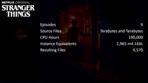
Netflix used their internal spot market to save 92% on video encoding costs. The story of how is told by Dave Hahn in his now annual A Day in the Life of a Netflix Engineer. Netflix first talked about their spot market in a pair of articles published in 2015: Creating Your Own EC2 Spot Market Part 1 and Part 2.
The idea is simple:
Netflix runs out of three AWS regions and uses hundreds of thousands of EC2 instances; many are underutilized at various parts in the day.
Video encoding is 70% of Netflix’s computing needs, running on 300,000 CPUs in over 1000 different autoscaling groups.
So why not create a spot market out of their own underutilized reserved instances to process video encoding?
Before proceeding let's define what a spot market is:
Spot Instances enable you to request unused EC2 instances, which can lower your Amazon EC2 costs significantly. The hourly price for a Spot Instance (of each instance type in each Availability Zone) is set by Amazon EC2, and adjusted gradually based on the long-term supply of and demand for Spot Instances. Your Spot Instance runs whenever capacity is available and the maximum price per hour for your request exceeds the Spot price.
At any point in time AWS has a lot of underutilized instances. It turns out so does Netflix. To understand why creating an internal spot market helped Netflix so much, we'll first need to understand how they encode video.
Now you can <img src=".mp4"> in Safari Technology Preview
Early results show mp4s in <img> tags display 20x faster and
decode 7x faster than the GIF equivalent — in addition to being
1/14th the file size!
Background CSS video & Responsive Video can now be a “thing”.
Finally cinemagraphs without the downsides of GIFs!
Now we wait for the other browsers to catch-up: This post is
46 MB on Chrome but 2 MB in Safari TP
It’ll take a few years for this to catch on web-wide, but the benefits are massive. It’s really rather ridiculous how popular the GIF format is in 2017.
The closure of two major Cydia repositories is arguably the result of a declining interest in jailbreaking, which provides root filesystem access and allows users to modify iOS and install unapproved apps on an iPhone, iPad, or iPod touch.
I can’t see why anyone would want to jailbreak an iOS device today, other than a spare device for goofing around on. The security implications are severe and the advantages negligible.
There’s nothing I recommend about the Pixel Buds. They’re cheap-feeling and uncomfortable, and you’re better off using the Google Translate app on a phone instead of trying to fumble with the headphones while trying to translate a conversation. The idea is neat, but it just doesn’t work well enough to recommend to anyone on any level.
Many people realize that smartphones track their locations. But what if you actively turn off location services, haven’t used any apps, and haven’t even inserted a carrier SIM card?
Even if you take all of those precautions, phones running Android software gather data about your location and send it back to Google when they’re connected to the internet, a Quartz investigation has revealed.
Since the beginning of 2017, Android phones have been collecting the addresses of nearby cellular towers — even when location services are disabled — and sending that data back to Google. The result is that Google, the unit of Alphabet behind Android, has access to data about individuals’ locations and their movements that go far beyond a reasonable consumer expectation of privacy.
Quartz observed the data collection occur and contacted Google, which confirmed the practice.
The cell tower addresses have been included in information sent to the system Google uses to manage push notifications and messages on Android phones for the past 11 months, according to a Google spokesperson. They were never used or stored, the spokesperson said, and the company is now taking steps to end the practice after being contacted by Quartz. By the end of November, the company said, Android phones will no longer send cell-tower location data to Google, at least as part of this particular service, which consumers cannot disable.
If they were “never used or stored”, why did they start collecting them in the first place? This is like a kid caught with their hand in the cookie jar saying they weren’t going to eat any cookies. Sure.
Excellent investigation by Kashmir Hill, writing for Gizmodo, on Facebook’s creepy “People You May Know” system:
In the months I’ve been writing about PYMK, as Facebook calls it,
I’ve heard more than a hundred bewildering anecdotes:
A man who years ago donated sperm to a couple, secretly, so they
could have a child — only to have Facebook recommend the child
as a person he should know. He still knows the couple but is not
friends with them on Facebook.
A social worker whose client called her by her nickname on their
second visit, because she’d shown up in his People You May Know,
despite their not having exchanged contact information.
A woman whose father left her family when she was six years old
— and saw his then-mistress suggested to her as a Facebook
friend 40 years later.
An attorney who wrote: “I deleted Facebook after it recommended
as PYMK a man who was defense counsel on one of my cases. We had
only communicated through my work email, which is not connected
to my Facebook, which convinced me Facebook was scanning my work
email.”
Even if, like me, you’ve never even signed up for Facebook, they almost certainly have a detailed profile of you.
Every year, as I travel around the security conference circuit,
the hallway conversations always turn to the interesting things
attendees have seen lately. To be honest, I can’t remember the
last time I was excited about a legitimately cool security
technology. I see plenty of security evolution, but not much
revolution.
That is, until my iPhone X arrived on launch day, and I got to try
Face ID in real-world usage. Put simply, Face ID is the most
compelling advancement in security I have seen in a very long
time. It’s game-changing not merely due to the raw technology, but
also because of Apple’s design and implementation.
In these instances the iPhone X is reaching the very pinnacle of
computing: doing a necessary job, in this case security, better
than humans can. The fact that this case is security is
particularly noteworthy: it has long been taken as a matter of
fact that there is an inescapable trade-off between security and
ease-of-use; TouchID made it far easier to have effective security
for the vast majority of situations, and FaceID makes it
invisible.
The trick Apple pulled, though, was going beyond that: the first
time I saw notifications be hidden and then revealed (as in the
GIF above) through simply a glance produced the sort of
surprise-and-delight that has traditionally characterized Apple’s
best products. And, to be sure, surprise-and-delight is
particularly important to the iPhone X: so much is new,
particularly in terms of the interaction model, that frustrations
are inevitable; in that Apple’s attempt to analogize the iPhone X
to the original iPhone is more about contrasts than comparisons.
“Surprise and delight” are intangibles. You can’t measure them with a benchmark or instrument. There are contingents of hardcore power user and open source nerd types who disdain surprise and delight as product attributes — and no surprise, those are the folks who seem to be dismissing iPhone X as a cynical cash grab.
I figured that if this reporter found corporate taxes baffling, so
did lots of sophisticated Fortune readers. So I dug into the
financials of Apple to grasp how the world’s most valuable
publicly traded company accounts for taxes. Albert Meyer, a
forensic accountant and former academic who runs investment firm
Bastiat Capital, helped explain how and why Apple books or defers
taxes on different categories of income, and which rates it
applies to each category. With his help, I present a primer on
taxation of multinationals, using Apple as a case study.
I still don’t quite understand the whole thing, but I have a much better grasp than I did before. And I’m more convinced than ever that Apple is doing something complicated, not something devious.
It’s important to emphasize that Apple actually pays a lot of tax
compared to other U.S.-based corporations with immense foreign
earnings, and takes a highly conservative approach to tax
accounting. […]
For FY 2016, Apple booked total pre-tax earnings of $61.4 billion.
On its income statement, Apple showed a “provision for taxes” of
$15.685 billion. That number is an expense that’s deducted
straight from pre-tax income of $61.4 billion to yield net income
of $45.7 billion. Hence, its reported “effective tax rate” was
25.6% ($15.685 billion divided by $61.4 billion), well below the
official 35%, but on the high side for multinationals, many of
which are in the teens.
The news coverage on Apple’s tax avoidance would lead you to believe (and in fact has led many to believe) that Apple pays a lower effective tax rate than most companies, when the truth is they pay a higher rate than most of their peers.
And later:
It’s important to note that Apple is extremely responsible in the
use of this exemption for reinvested earnings. Many multinationals
report that they intend to plough all of their foreign profits
into operations, and hence, don’t make any accruals for U.S. taxes
on their offshore earnings. Apple is the rare tech titan that books
large annual accruals that lower net income.
The problem isn’t Apple’s tax structure, it’s U.S. law. You can argue that Apple should voluntarily pay more in taxes than they’re legally obligated to, but no one who holds such views would ever get hired as a finance executive at a large publicly held company.
Twitter’s destroyed its USP. The whole point, for me, was how
inventive people could be within that concise framework.
USP is “unique selling proposition”. By doubling the character limit, Twitter has eliminated what made them unique. Yes, there were many trade-offs with the 140-character limit, both pros and cons. But one of the pros is it made Twitter unique. Twitter timelines now look more like Facebook — but Facebook is already there for Facebook-like timelines. Twitter trying to be more like Facebook is like basketball trying to be more like football — a bad idea that won’t work.
99% of you people don’t even deserve 140 characters.
It’s no surprise that writers, in particular, object to this change. I agree with Ihnatko — the 140-character limit made it a challenge. Fitting certain complex thoughts into a mere 140 characters sometimes felt like solving a small challenge, like one of The New York Times’s tiny little 5 × 5 crossword puzzles.
Given 280 characters, people are going to use them, even to express thoughts that could have fit in 140. Given unlimited characters, such as in email, people ramble aimlessly.
That’s why email feels like a dreary chore, and Twitter feels like fun. The fewer tweets that fit in a single screen at a time, the less fun Twitter feels. I’m sure Twitter considered this change carefully, but I’m convinced they’ve made a terrible mistake.
Andrew Tanenbaum, creator of the MINIX operating system, in an open letter to Intel CEO Brian Krzanich:
Thanks for putting a version of MINIX 3 inside the ME-11
management engine chip used on almost all recent desktop and
laptop computers in the world. I guess that makes MINIX the most
widely used computer operating system in the world, even more than
Windows, Linux, or MacOS. And I didn’t even know until I read a
press report about it. Also here and here and
here and here and here (in Dutch), and a bunch of
other places.
It’s an interesting development, having a full-blown operating system running inside a CPU. And it’s a nice feather in the cap for MINIX, which heretofore had best been known as a teaching OS for computer science students. But it can’t be the most-used OS in the world. Android is. (Or, if you only want to count the kernel-level operating system, Linux, which runs at the heart of Android.)
MINIX is now almost certainly the most widely-used OS on Intel-based computers, but Intel-based computers are now far outnumbered by ARM-based ones.
Two weeks after starting my cheap Pixel 2 earbud search, I finally
have a working pair — but they cost almost twice the amount I
wanted to spend, and don’t feel very premium. If I lose or break
them, it’ll cost me almost $50 and another 10-day wait. The next
time I upgrade my phone, they may not be compatible. Even the
Apple Store sells $29 Lightning EarPods. Google needs to do a lot
better by its Pixel owners than a single $149 USB-C option. Even
better, just give us back the damn headphone jack.
Apple does better than selling $29 Lightning earbuds — they include a pair in the box with every iPhone. It’s embarrassing that Google doesn’t include a pair of USB-C earbuds with the Pixels.
I’ve been using Face ID on the iPhone X for more than 24 hours,
and I don’t need a stopwatch to tell you that it unlocks my phone
slower than when I was using Touch ID on my older iPhone 7 Plus. I
used a stopwatch app anyway to prove my point.
With Face ID on the iPhone X, it took 1.2 seconds from pressing
the side button to the iPhone X’s screen turning on and for the
phone to recognize me and unlock the device. And it was another
0.4 seconds to swipe up to get to the lock screen. Total time: 1.8
seconds.
On my iPhone 7 Plus, I could get to the home screen just by
pressing and holding my thumb on the Touch ID sensor in an
average of 0.91 seconds. That might not seem like a lot of time,
but it adds up quickly when you’re unlocking your phone dozens of
time a day.
There is a workaround of sorts, though. You can swipe up from the
bottom of the iPhone X’s screen even while the iPhone X is looking
for your face. Sometimes you might briefly see the word “Face ID”
flash as the iPhone X transitions to the home screen, but you will
still get to start using your phone faster.
This is not a “workaround”. This is how you’re supposed to unlock iPhone X. Starting with a tap of the side button is not how you’re supposed to do it — you’re creating a two-step process where you only need one.
If raise-to-wake kicks in and turns on the display, all you need to do is swipe up from the bottom. Don’t wait for the lock icon to change — don’t even worry about it. Just swipe up. If raise-to-wake hasn’t kicked in, and you’re holding your iPhone X in your hand with the display off, just tap the screen near the bottom and immediately swipe up. The best way to use Face ID is to pretend it isn’t even there, and just swipe up from the home indicator.
Tapping the screen to wake the display is one of my favorite features so far. There’s really no reason to use the side button to wake the phone.
“We can see from the initial response, customer demand is off the
charts,” an Apple spokeswoman told Reuters.
“We’re working hard to get this revolutionary new product into the
hands of every customer who wants one, as quickly as possible.”
I was up to order when it went live last night. My wife’s order went through with a delivery date of “November 17-24” after about 10 minutes of force-quitting/relaunching the iOS Apple Store app; my order went through a few minutes later, with delivery slipping to “December 5-11”.
Even today, though, orders are still only 5-6 weeks out. I was worried supply would be so tight that they’d be into January by now.
A decade ago, a five-second clip of a prairie dog went viral. “Dramatic Chipmunk,” as it was erroneously titled, captivated the internet — and dramatic zooms have featured in popular culture ever since. And while you’ve long been able to create one by using the manual zoom feature of your smartphone camera, Instagram has a new tool that will do it for you automatically.
Superzoom, which is rolling out today on Android and iOS, lets you create a Dramatic Chipmunk-style zoom with a single tap. Highlight the tool in the story camera, choose the front- or rear-facing camera, and then tap the button. If you tap once you’ll create a 3-second Superzoom; you can tap and hold to create a longer one. All Superzooms include dramatic music to...
Andrew Martonik and Jerry Hildenbrand, writing for Android Central:
Consternation surrounding the display in the Google Pixel 2 XL is
well known at this point, and to be honest most of it has been
pretty overblown. But we have something new to talk about now:
screen burn-in. It’s something people with OLED screens worry
about (to varying degrees) and something people who prefer LCDs
like to poke fun about. But one of our Pixel 2 XL review units, in
use for about a week, is already seeing some pretty crazy levels
of burn-in.
Dieter Bohn is seeing it on his review unit as well. What a disaster this display is. I popped into my local Verizon store over the weekend to see the new Pixels firsthand. The blue tint when looking at the Pixel 2 XL from even a slight angle is a real issue. The display on the regular Pixel 2 — which is an LCD display, not OLED which is an OLED from Samsung, not LG — looks terrific, though.